We are relocating our blog to a WordPress server environment to accommodate new functionality and a new design.
http://www.gestaltu.com
Please visit us there for the next instalments in the Dynamic Asset Allocation for Practitioners series and more novel research, tools and insight from the GestaltU team!
Tuesday, July 2, 2013
Thursday, June 20, 2013
Dynamic Asset Allocation for Practitioners Part 2: Risk Adjusted Momentum
*Note that, in an effort to be consistent, we have updated the tables and charts in article 1 to reflect data through the end of May so that results are comparable with the results in this article.
Introduction:
Introduction:
In article 1 of this series, we examined several ways of measuring the momentum factor in the context of a dynamic asset allocation framework. We presented results backed by years of data and found that some measures were superior, while others exhibited a slightly different character. This is largely attributed to the responsiveness of how different metrics react to new asset trends. In this second article in our series, we dig deeper into additional momentum metrics by measuring the momentum of asset classes against a variety of risk measures.
From an opportunity cost perspective, investors are faced with an assortment of return streams and the asset allocator must intelligently select combinations to maximize return and minimize risk. This article will allow us to compare methods of selecting assets based on risk adjusted momentum to methods that select assets based on raw momentum measures.
Methodology:
Similar to our first article series, we are going to be applying the same analytical framework with 13 different indicators. We aim to avoid presenting curve fitted results that look promising in sample but are unlikely to perform as expected out of sample.
More specifically, we take into account portfolio concentration and universe specification. The former refers to the performance of strategies holding the top N different assets at each rebalance. Rather than arbitrarily choose a top N based on what has worked best in the past, our results will average the results of holding between 2 and 5 top assets.
Universe specification bias is the potential bias arising from our preselected universe of assets. If the performance of a system is largely attributed to holding one or two lucky assets, future performance may be highly dependent on including the best performing asset in the future, which we may not know about today. To minimize this probability, we created a framework whereby performance is measured through sequentially dropping one asset at a time, and averaging the results across universes. This helps to minimize universe pre-selection bias.
Our 10 asset universe:
- Commodities (DB Liquid Commoties Index)
- Gold
- U.S. Stocks (Fama French top 30% by market capitalization)
- European Stocks (Stoxx 350 Index)
- Japanese Stocks (MSCI Japan)
- Emerging Market Stocks (MSCI EM)
- U.S. REITs (Dow Jones U.S. Real Estate Index)
- International REITs (Dow Jones Int'l Real Estate Index)
- Intermediate Treasuries (Barclays 7-10 Year Treasury Index)
- Long Treasuries (Barclays 20+ Year Treasury Index)
The following description from our first article expands on the technical methodology:
“For each strategy we will show the average statistics for all simulations with 2, 3, 4, and 5 holdings, and across all 11 asset universes. Recall that we are testing the full 10 asset class universe, as well as 10 other 9 asset class universes where one of the original assets is removed. So the statistics for each strategy will actually represent an average (median) of 44 simulations (4 portfolio concentrations x 11 universes). We will then present modified histograms to illustrate the range of outcomes for each strategy.”
Momentum Metrics
We are going to present 13 different risk adjusted momentum measures and test them over the period 1995 - present. Each different indicator, while correlated, differs in their way of measuring risk and return. While on average the assets held are similar, there are instances where certain metrics will yield different holdings, providing an opportunity for diversification across methodologies.
The following are the short descriptions and formulas:
- Sharpe Ratio- Created by William Sharpe, it is a popular risk adjusted ratio that measures excess return per unit of volatility, according to the following formula:
- Omega Ratio- The Omega Ratio is a measure that takes into account all the different moments of the distribution. It separates return above and below a given threshold before calculating a ratio between the two means of the two vectors.

- Sortino Ratio- The Sortino Ratio is a modified version of the Sharpe ratio. While the Sharpe ratio takes into account both upside and downside volatility the Sortino ratio only uses the downside semi deviation in the denominator. The intuition behind this measure is that investors don’t penalize upside volatility, so the risk measure should only focus on downside risk.

DR simply represents the downside semi-deviation.
- Calmar Ratio (MAR)- Published by the Managed Accounts Reports, this risk return measure uses the largest drawdown as its proxy for risk. It is widely used to gauge an investment’s annualized return to its maximum drawdown.

- DVR- This ratio, which was formalized by David Varadi, is concerned with both returns per unit of risk, and the linear fit of the price trajectory. Technically, it is the product of the Sharpe ratio and the coefficient of determination, or R-squared measure, fit to the price trajectory through time.

- Value at Risk- Used widely in the financial industry for measuring firm wide risk and exposure, the Value at Risk calculates, for a given confidence level, the magnitude of expected loss. We took this risk measure and incorporated the mean return to derive a risk return ratio.

- Conditional Value at Risk- A variation of the VaR, the Conditional Value at Risk is simply the median value of all return observations between the maximum loss and the VaR for a given confidence level. Theoretically, it does a better job of capturing the true tail risk. Similar to the above, we adjusted it for the mean return for a risk return ratio.

- Return to Max Loss Ratio- The max loss ratio uses the worst daily return as a proxy for risk.


- Return to Average Drawdown Ratio- The Average drawdown ratio simply takes return and adjust it for the average drawdown over the entire period.

- High Low Differential- More sophisticated in calculation, the High Low Differential takes in to account the current position relative to the highest and lowest prices in a prescribed period.


- Ulcer Index- Created by Peter Martin in 1987, the index takes into account risk from drawdowns as oppose to traditional volatility. It is derived from deviations from the most recent highs. The following is the pseudocode for computing the Ulcer Index (UI), the following is the equation employing the UI to derive the UPI.
SumSq = 0
MaxValue = 0
for T = 1 to NumOfPeriods do
MaxValue = 0
for T = 1 to NumOfPeriods do
if Value[T] > MaxValue then MaxValue = Value[T]
else SumSq = SumSq + sqr(100 * ((Value[T] / MaxValue) - 1))
else SumSq = SumSq + sqr(100 * ((Value[T] / MaxValue) - 1))
UI = sqrt(SumSq / NumOfPeriods)
Source: http://www.tangotools.com/ui/ui.htm

- Gain to Pain Ratio- Popularized in the book Hedge Fund Market Wizards by Jack Schwager, this ratio takes the sum of all positive periods divided by the sum of all the negative periods.

- Fractal Efficiency- The most efficient line segment between two points is a straight line. Essentially, fractal efficiency is the ratio between the straight-line magnitude of price change over the period divided by the distance the price actually traveled on its path. The equation below should help with the intuition.

Like our last post, we have applied the same transformation to standardize the momentum measures to avoid temporal issues from employing multiple lookback horizons. Again, our standardization equation is:

Results
The median performance table (Table 1.) summarizes the summary statistics of our 13 momentum risk adjusted systems. Results represent the median across all combinations of varying concentrations and universes, so each statistic summarizes performance across 44 individual tests. Among the top contenders we have the DVR and return / Max Loss Ratio from a risk-adjusted basis (Sharpe), and the return / Ulcer Index (UPI) indicator delivers the best return / maximum drawdown (MAR).
Table 1. Median Performance Summary

Source: Bloomberg
Perhaps counter-intuitively, the risk adjusted momentum portfolios exhibit lower Sharpe ratios than the raw momentum systems tested in Article 1. As you will see, it may be more coherent, and produce better results, to disaggregate the application of risk management from the momentum measure.
Chart 1-14 Performance Distributions.


Source: Bloomberg
Charts 1-14 display the equity line distributions from varying concentration and universes. Visualizing the equity lines in such a way allows one to identify the consistency from all the different combinations. The robustness of a system is measured as a function of how it responds to changing environments and parameters. Methods that are resilient to different universes and portfolio concentrations are likely to deliver more stable results out of sample.
A cursory glance reveals that the Low-High Differential shows the most variability while the Gain to Pain Ratio (debatable) shows the least.
Chart 15-54 Charts (CAGR)


Max Drawdown


Sharpe


Consistent with our previous post's analytical framework, we show the distribution of performance statistics across all of the 44 universe/concentration combinations for each risk adjusted momentum method.
Below we plot the percentile performance of each system’s CAGR, Sharpe, and Maximum Drawdown, paying special attention to scores at the 5th percentile, because this quantile is standard for interpreting statistical significance. Whereas the instantaneous slope measure proved to be the most consistent performer at the 5th percentile among raw momentum metrics in Article 1, the Gain to Pain ratio seems to deliver the most consistent performance of all the risk adjusted momentum indicators.
Charts 55 through 57 show the average performance of each methodology with portfolio concentrations of 2 holdings through 5 holdings across all 11 asset universes tested.
Chart 55: CAGR

Source: Bloomberg
Chart 56: Max Drawdown

Source: Bloomberg
Chart 57. Return / risk ratio

Source: Bloomberg
Consistent with observations from Article 1., while more concentrated portfolios tend to deliver higher returns, the highest Sharpe ratios are derived from portfolios with 3 or 4 holdings. However, in contrast with the raw momentum tests, risk adjusted portfolios seem to deliver monotonically smaller drawdowns moving from 2 holdings to 5 holdings.
Indicator Diversification
Any single strategy by itself suffers its own structural inadequacies because no individual indicator or system effectively captures all of the information that is available in the price series.
Chart 58 Correlation Matrix

Source: Bloomberg
Although the correlations between the systems are highly correlated, they only capture the long-term average correlation over the entire period. If one were to view them on a rolling basis, they will identify periods where their returns diverge. To prove this point we aggregated the systems all together in an equal weight index.
Chart 59 and Table 2.


Comparing the index to all the constituent systems from Table 1., we observe a material reduction in volatility and drawdown. Among the improved performance statistics include Sharpe, Maximum Drawdown, and rolling positive 12 month periods. Clearly the different measures of risk capture slightly different information, which offers diversification at more critical times.
Conclusion
Articles 1. and 2. have analyzed the subject of momentum superficially by introducing myriad indicators to measure the momentum anomaly. While they differ in their calculation, all of them measure the strength of recent 1 to 12 month absolute or risk-adjusted price strength. To now, we have held all assets in equal weight to focus attention purely on the momentum metric.
Friday, May 31, 2013
Dynamic Asset Allocation for Practitioners Part 1: The Many Faces of Momentum
A (Very) Short History of Dynamic Asset Allocation
The field of tactical or dynamic asset allocation has grown dramatically since Mebane Faber published what is perhaps the first broadly accessible paper on the topic in 2007, 'A Quantitative Approach to Tactical Asset Allocation'. Faber's original paper utilized a simple 10 month moving average as a signal to move into or out of a basket of 5 major global asset classes. Over the period 1970 through the paper's 2009 update, this technique generated better returns than any of the individual assets in the sample universe - U.S. and EAFE stocks, U.S. real estate, Treasuries and commodities - and with substantially lower risk than the equal weight basket or a 60/40 stock/Treasury portfolio.
In 2009 Faber published a follow-up paper called 'Relative Strength Strategies for Investing' which introduced the concept of price momentum as a way to distinguish between strong and weak assets in the portfolio. That paper applied an intuitive method of capturing asset class momentum that involved averaging each asset's rate of change (ROC) across five lookback horizons, specifically 1, 3, 6, 9 and 12 months. By averaging across lookback horizons, this approach captures momentum at multiple periodicities, and also identifies acceleration by implicitly weighting near-term price moves more heavily than price moves at longer horizons.
In May of 2012 we published a whitepaper entitled, "Adaptive Asset Allocation: A Primer", a quantitative systematic methodology integrating the simple ROC based momentum concepts introduced in Faber's 'Relative Strength' paper with techniques derived from the portfolio optimization literature. Specifically, the paper explained how applying a minimum variance optimization overlay to a portfolio of high momentum assets serves to stabilize and strengthen both absolute and risk-adjusted portfolio performance.
Article Series
We are going to range far and wide in our exploration of global dynamic asset allocation. This article, the first in our series, will explore a variety of methods to rank assets based on price momentum. The second article will introduce several approaches to rank assets based on risk-adjusted momentum measures. The third article will introduce a framework for thinking about portfolio optimization, including several heuristic and formal optimization methods.
Our fourth article will discuss ways of combining the best facets of momentum with the best techniques for portfolio optimization to offer a coherent framework for global dynamic asset allocation. The objective here will be robustness and logical coherence rather than utilizing optimization for best in-sample simulation performance.
Lastly, we are considering introducing some ensemble concepts and adaptive frameworks as a cherry on top, but we aren't sure how far we want to go yet, so we'll just get started and see where it takes us.
The following illustrates the proposed framework for this article series:

Methodology
This first article will explore a variety of methods for identifying trend strength for asset allocation, with the goal of comparing and contrasting the various methods under different assumptions of portfolio concentration and asset universe specifications.
We take the position that portfolio concentration is a source of potential data mining bias because the results for dynamic asset allocation approaches can vary widely depending on the number of top assets that are held in the portfolio at each rebalance. Some approaches do better with more concentration, and others with less. We will test with concentrations of top 2, 3, 4 and 5 assets and average the results.
The asset universe can serve as a source of potential 'curve fitting' as well, as it is easy and compelling to want to remove assets from the universe that drag down returns in simulation, or add assets with strong results over the backtest horizon.
To avoid this trap, we run our simulations on a diversified universe of 10 global asset classes, as well as ten other asset universes where we drop one of the ten original assets. This helps to control for the chance that strong performance is simply the result of one dominant asset class over the period.
The ten asset classes we will use for all testing are:
It is important to decide how we will evaluate the relative efficacy of the various approaches before we start testing. For each strategy we will show the average statistics for all simulations with 2, 3, 4, and 5 holdings, and across all 11 asset universes. Recall that we are testing the full 10 asset class universe, as well as 10 other 9 asset class universes where one of the original assets is removed. So the statistics for each strategy will actually represent an average (median) of 44 simulations (4 portfolio concentrations x 11 universes). We will then present modified histograms to illustrate the range of outcomes for each strategy. This represents a rare test of robustness across methodologies.
Toward the bottom of this article, we demonstrate how combining all of the indicators into a naive ensemble delivers better performance than any of them individually.
Momentum Metrics
For the purpose of this article we used 8 indicators for measuring trend strength. All of the metrics rank assets at monthly rebalance periods based on an average of values observed over the lookback windows described above, which were chosen to be consistent with Mebane Faber's original momentum paper.
The intuition behind testing a variety of momentum techniques relates to the ability of different measures to stabilize the estimate using simple or advanced ensemble process.
The following list describes the mechanics of each method of momentum calculation, where t is the current date, n is the lookback parameter, and N is the number of assets in the testing universe. Note that each indicator is calculated at each of the 5 lookbacks, and then the indicators are averaged across lookbacks to generate the final measure.
Importantly, because we measure trend strength across five lookback time horizons, the cross sectional measure of price momentum needs to be standardized. It is silly to average an annualized 20 day ROC with a 250 day ROC because the 20 day ROC will deliver much more extreme values, on average, than the 250 day ROC, and will dominate the momentum measure commensurately.
There are a number of ways to standardize the momentum measure across lookbacks, but the method we used was to calculate each asset's proportion of total absolute cross sectional momentum across all assets over each lookback horizon, holding the sign constant.

Again, standardized momentum scores are then averaged across all lookbacks to determine the final momentum score for each asset.
Results
Table 1. displays the salient statistics for tests of each of the momentum methods (indicators) described above. Each cell describes the median performance across all 44 combinations (holding 2 - 5 positions, 11 universe combinations) that we tested for each methodology.
Chart 1. Median performance summary

Data sources: Bloomberg
The instantaneous slope method seems to deliver the best median performance statistics all around, with the highest overall returns, the highest Sharpe, and the lowest median Maximum Drawdown of all methods. But the median is just one point on the distribution; let's see what the range of outcomes looks like for each system.
Performance Distribution
Charts 1 through 9 below show all 44 of the equity lines (4 concentrations x 11 universe combinations) that were used to calculate the median performance measures in Table 1 for each momentum indicator. The first highlighted chart shows all 352 equity lines derived from all 44 portfolio combinations across all 8 indicators.
Charts 1 - 9: Equity lines for indicators across 44 universe/concentration combinations

Source: Bloomberg
A few observations stand out from these charts. First, they all look a little different, with waves of surges and drawdowns occurring at slightly different times across momentum measures, though all of them show a drawdown in 2008. Second, notice that in some charts the equity lines all cluster together in a narrow range - z-score and instantaneous slope stand out in this respect - while others exhibit quite a wide range of outcomes - price to SMA differential and SMA differential for example.
Charts 10 through 43 below quantify the distribution of return, Sharpe, and Maximum Drawdown outcomes across all 44 versions of each momentum system using a cumulative histogram. In our opinion, the most realistic way to evaluate the performance of a system is on the basis of performance statistics near the bottom of the distribution. The worst outcome could be an outlier, but traditional tests of statistical significance focus on 5th percentile outcomes, so that is where we focus our attention. In each series of charts, we have highlighted the approach with the best results at the 5th percentile.
Charts 10 - 43: Distribution of performance metrics across 44 universe/concentration combinations.

Source: Bloomberg
Range of Sharpe(0%) by Indicator
Source: Bloomberg
Range of Max Drawdowns by Indicator

Source: Bloomberg
(You will note that the numbers in the 50% column of the charts above are the same as the numbers in Table 1 summary, as the median is simply the 50th percentile value).
Charts 24 through 26 show the average performance of each methodology with portfolio concentrations of 2 holdings through 5 holdings across all 11 asset universes tested. It is interesting to see that, while more concentrated portfolios tend to deliver higher returns, the highest Sharpe ratios are derived from portfolios with 3 or 4 holdings, and these more diversified portfolios tend toward much lower drawdowns as well.
Chart 24. Average indicator returns across 11 asset universe combinations with different portfolio concentration


Source: Bloomberg

Source: Bloomberg
Indicator Diversification
We know from charts 1 - 9 that the different momentum indicators, universe and concentration combinations all deliver slightly different results, where equity rises and falls at slightly different rates. But how different is the performance across indicators really?
Matrix 1. shows the correlations between daily returns for all indicator combinations. The daily returns for all universe and concentration combinations were averaged to generate the final return series for each indicator.
Matrix 1. Pairwise correlations between indicators (average of 44 combinations for each indicator)
Source: Bloomberg

The correlations range from about 0.8 between the t-distribution method and the ROC and instantaneous slope methods, to 0.99 between instantaneous slope and ROC. The average pairwise correlation is 0.936. With correlations so high, to what extent can we take advantage of the different methods to create a diversified system composed of all 352 combinations? Chart 27 and Table 2. give us the answer.
Chart 27. Aggregate Index of all 352 indicator/universe/concentration combinations, equal weight.
 Source: Bloomberg
Table 2. Summary statistics for Aggregate Index

Source: Bloomberg
Despite the high average correlations between the different momentum systems, the aggregate equity line provides a material boost to all risk adjusted statistics. While the returns are about 1% below the returns derived from the best individual indicators, the Sharpe(0%) ratio is better than all of them. Further, the average volatility of the 8 individual systems is 12.42%, while the volatility of the aggregate system is the lowest of all at just 11.1%. Lastly, the aggregate system exhibits the lowest drawdowns and the highest percentage of positive rolling 12-month periods.
Obviously it is impractical to run 352 models in parallel, even if they are all closely related. Moreover, this approach is far from the best method to aggregate all of the information from the different indicators; we will touch on different methods of aggregation in our fourth instalment of this series. However, there is clearly value in finding ways to blend various momentum factors to create a more stable allocation model.
Conclusions and Next Steps
In this article we have explored a variety of methods to measure the price momentum of a universe of asset classes for the purpose of creating global dynamic asset allocation models. Given our objective to avoid as much optimization as possible, we tested each momentum method using 4 different levels of portfolio concentration, and 11 slightly modified asset class universes. This approach provided 44 distinct tests for each indicator, which allowed us to investigate the stability of each indicator across parameters.
Among the individual momentum indicators we tested, the instantaneous slope method delivered the best performance in terms of median returns, Sharpe(0%), drawdowns and percent positive 12-month periods.
We investigated the impact of different levels of portfolio concentration on performance and discovered, perhaps not surprisingly, that more concentrated portfolios deliver stronger returns, while some diversification does improve risk-adjusted outcomes.
We examined the correlations between the indicator systems and determined that they are all closely related, with average pairwise correlations of about 0.93. However, even with such high average correlations, aggregating the systems into one system composed of all 352 indicator/concentration/ universe combinations delivered the most stable results of all.
Article 2 in our series will perform a similar analysis of several risk-adjusted momentum measures, such as Sharpe ratio, Omega ratio, and Sortino Ratio. As in this article, the Article 2 will hold all portfolio positions in equal weight, but Article 3 will introduce methods to optimize the weights of portfolio holdings to further improve absolute and risk adjusted returns - quite significantly.
We are just scratching the surface of what is possible with tactical alpha. Chart 27 and Table 3. offer a glimpse of what's to come. Stay tuned.
[Update: Charts and Performance are updated through end of May]
Chart 27. Mystery system
 Source: Bloomberg
Table 3. Mystery system stats

The field of tactical or dynamic asset allocation has grown dramatically since Mebane Faber published what is perhaps the first broadly accessible paper on the topic in 2007, 'A Quantitative Approach to Tactical Asset Allocation'. Faber's original paper utilized a simple 10 month moving average as a signal to move into or out of a basket of 5 major global asset classes. Over the period 1970 through the paper's 2009 update, this technique generated better returns than any of the individual assets in the sample universe - U.S. and EAFE stocks, U.S. real estate, Treasuries and commodities - and with substantially lower risk than the equal weight basket or a 60/40 stock/Treasury portfolio.
In 2009 Faber published a follow-up paper called 'Relative Strength Strategies for Investing' which introduced the concept of price momentum as a way to distinguish between strong and weak assets in the portfolio. That paper applied an intuitive method of capturing asset class momentum that involved averaging each asset's rate of change (ROC) across five lookback horizons, specifically 1, 3, 6, 9 and 12 months. By averaging across lookback horizons, this approach captures momentum at multiple periodicities, and also identifies acceleration by implicitly weighting near-term price moves more heavily than price moves at longer horizons.
In May of 2012 we published a whitepaper entitled, "Adaptive Asset Allocation: A Primer", a quantitative systematic methodology integrating the simple ROC based momentum concepts introduced in Faber's 'Relative Strength' paper with techniques derived from the portfolio optimization literature. Specifically, the paper explained how applying a minimum variance optimization overlay to a portfolio of high momentum assets serves to stabilize and strengthen both absolute and risk-adjusted portfolio performance.
Article Series
We are going to range far and wide in our exploration of global dynamic asset allocation. This article, the first in our series, will explore a variety of methods to rank assets based on price momentum. The second article will introduce several approaches to rank assets based on risk-adjusted momentum measures. The third article will introduce a framework for thinking about portfolio optimization, including several heuristic and formal optimization methods.
Our fourth article will discuss ways of combining the best facets of momentum with the best techniques for portfolio optimization to offer a coherent framework for global dynamic asset allocation. The objective here will be robustness and logical coherence rather than utilizing optimization for best in-sample simulation performance.
Lastly, we are considering introducing some ensemble concepts and adaptive frameworks as a cherry on top, but we aren't sure how far we want to go yet, so we'll just get started and see where it takes us.
The following illustrates the proposed framework for this article series:

Methodology
This first article will explore a variety of methods for identifying trend strength for asset allocation, with the goal of comparing and contrasting the various methods under different assumptions of portfolio concentration and asset universe specifications.
We take the position that portfolio concentration is a source of potential data mining bias because the results for dynamic asset allocation approaches can vary widely depending on the number of top assets that are held in the portfolio at each rebalance. Some approaches do better with more concentration, and others with less. We will test with concentrations of top 2, 3, 4 and 5 assets and average the results.
The asset universe can serve as a source of potential 'curve fitting' as well, as it is easy and compelling to want to remove assets from the universe that drag down returns in simulation, or add assets with strong results over the backtest horizon.
To avoid this trap, we run our simulations on a diversified universe of 10 global asset classes, as well as ten other asset universes where we drop one of the ten original assets. This helps to control for the chance that strong performance is simply the result of one dominant asset class over the period.
The ten asset classes we will use for all testing are:
- Commodities (DB Liquid Commoties Index)
- Gold
- U.S. Stocks (Fama French top 30% by market capitalization)
- European Stocks (Stoxx 350 Index)
- Japanese Stocks (MSCI Japan)
- Emerging Market Stocks (MSCI EM)
- U.S. REITs (Dow Jones U.S. Real Estate Index)
- International REITs (Dow Jones Int'l Real Estate Index)
- Intermediate Treasuries (Barclays 7-10 Year Treasury Index)
- Long Treasuries (Barclays 20+ Year Treasury Index)
It is important to decide how we will evaluate the relative efficacy of the various approaches before we start testing. For each strategy we will show the average statistics for all simulations with 2, 3, 4, and 5 holdings, and across all 11 asset universes. Recall that we are testing the full 10 asset class universe, as well as 10 other 9 asset class universes where one of the original assets is removed. So the statistics for each strategy will actually represent an average (median) of 44 simulations (4 portfolio concentrations x 11 universes). We will then present modified histograms to illustrate the range of outcomes for each strategy. This represents a rare test of robustness across methodologies.
Toward the bottom of this article, we demonstrate how combining all of the indicators into a naive ensemble delivers better performance than any of them individually.
For the purpose of this article we used 8 indicators for measuring trend strength. All of the metrics rank assets at monthly rebalance periods based on an average of values observed over the lookback windows described above, which were chosen to be consistent with Mebane Faber's original momentum paper.
The intuition behind testing a variety of momentum techniques relates to the ability of different measures to stabilize the estimate using simple or advanced ensemble process.
The following list describes the mechanics of each method of momentum calculation, where t is the current date, n is the lookback parameter, and N is the number of assets in the testing universe. Note that each indicator is calculated at each of the 5 lookbacks, and then the indicators are averaged across lookbacks to generate the final measure.
- Total return - this is the most common measure of momentum, where assets are ranked on their historical total returns.

- SMA Differential - this technique uses the differential between a shorter term and longer term moving average as the momentum measure. We used our standard parameters to define the length of the longer SMAs. The length of corresponding short SMAs was simply 1/10th of the length of the longer SMA. So for example, for the 120 day parameter, we measured the differential between the 120 day SMA and the 12 day SMA.

- Price to SMA Differential - similar to SMA Differential, except that this technique uses the differential between the current price and the n-day SMA rather than using a shorter moving average.

- SMA Instantaneous Slope - For this metric we derived the instantaneous slope of each moving average. Essentially this measures the rate of change of each SMA using the difference between yesterday's SMA and today's SMA.

- Price Percent Rank - This metric captures the location of the current price relative to the security's range over each lookback period. The lowest price over the period would have a rank of 1, while the highest would have a rank of 100. The median price over the period would have a rank of 50.

- Z-Score - Analogous to the Price Percent Rank, z-score captures the magnitude that the current price deviates from the average price over the period.

- Z-Distribution - This method transforms the z-score to a percentile value on the cumulative normal distribution. Under this framework the trend strength measure will accelerate in magnitude as the price strays further away from the mean. The function to perform this translation is complicated, but it can be easily generated in Excel using the Norm.S.Dist(z, TRUE) function.

- T-Distribution - The normal distribution is valid when the sample size is large enough so that the sample is likely to be representative of the population. Under conditions where the sample size is small and the parameters that describe the distribution are unknown, a more appropriate choice is the Student's t-distribution. The t-distribution transforms a t-score into a percentile given the number of degrees of freedom. The degrees of freedom are equal to (n - 1).


Importantly, because we measure trend strength across five lookback time horizons, the cross sectional measure of price momentum needs to be standardized. It is silly to average an annualized 20 day ROC with a 250 day ROC because the 20 day ROC will deliver much more extreme values, on average, than the 250 day ROC, and will dominate the momentum measure commensurately.
There are a number of ways to standardize the momentum measure across lookbacks, but the method we used was to calculate each asset's proportion of total absolute cross sectional momentum across all assets over each lookback horizon, holding the sign constant.

Again, standardized momentum scores are then averaged across all lookbacks to determine the final momentum score for each asset.
Results
Table 1. displays the salient statistics for tests of each of the momentum methods (indicators) described above. Each cell describes the median performance across all 44 combinations (holding 2 - 5 positions, 11 universe combinations) that we tested for each methodology.
Chart 1. Median performance summary

Data sources: Bloomberg
The instantaneous slope method seems to deliver the best median performance statistics all around, with the highest overall returns, the highest Sharpe, and the lowest median Maximum Drawdown of all methods. But the median is just one point on the distribution; let's see what the range of outcomes looks like for each system.
Performance Distribution
Charts 1 through 9 below show all 44 of the equity lines (4 concentrations x 11 universe combinations) that were used to calculate the median performance measures in Table 1 for each momentum indicator. The first highlighted chart shows all 352 equity lines derived from all 44 portfolio combinations across all 8 indicators.
Charts 1 - 9: Equity lines for indicators across 44 universe/concentration combinations

Source: Bloomberg
A few observations stand out from these charts. First, they all look a little different, with waves of surges and drawdowns occurring at slightly different times across momentum measures, though all of them show a drawdown in 2008. Second, notice that in some charts the equity lines all cluster together in a narrow range - z-score and instantaneous slope stand out in this respect - while others exhibit quite a wide range of outcomes - price to SMA differential and SMA differential for example.
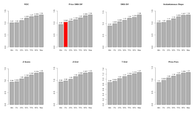
Charts 10 through 43 below quantify the distribution of return, Sharpe, and Maximum Drawdown outcomes across all 44 versions of each momentum system using a cumulative histogram. In our opinion, the most realistic way to evaluate the performance of a system is on the basis of performance statistics near the bottom of the distribution. The worst outcome could be an outlier, but traditional tests of statistical significance focus on 5th percentile outcomes, so that is where we focus our attention. In each series of charts, we have highlighted the approach with the best results at the 5th percentile.
Charts 10 - 43: Distribution of performance metrics across 44 universe/concentration combinations.
Range of CAGR by Indicator

Range of Sharpe(0%) by Indicator

Source: Bloomberg
Range of Max Drawdowns by Indicator

(You will note that the numbers in the 50% column of the charts above are the same as the numbers in Table 1 summary, as the median is simply the 50th percentile value).
Charts 24 through 26 show the average performance of each methodology with portfolio concentrations of 2 holdings through 5 holdings across all 11 asset universes tested. It is interesting to see that, while more concentrated portfolios tend to deliver higher returns, the highest Sharpe ratios are derived from portfolios with 3 or 4 holdings, and these more diversified portfolios tend toward much lower drawdowns as well.
Chart 24. Average indicator returns across 11 asset universe combinations with different portfolio concentration

Source: Bloomberg
Chart 25. Average indicator return/risk ratios across 11 asset universe combinations with different portfolio concentration

Chart 26. Average indicator Max Drawdowns across 11 asset universe combinations with different portfolio concentration

Indicator Diversification
We know from charts 1 - 9 that the different momentum indicators, universe and concentration combinations all deliver slightly different results, where equity rises and falls at slightly different rates. But how different is the performance across indicators really?
Matrix 1. shows the correlations between daily returns for all indicator combinations. The daily returns for all universe and concentration combinations were averaged to generate the final return series for each indicator.
Matrix 1. Pairwise correlations between indicators (average of 44 combinations for each indicator)
Source: Bloomberg

The correlations range from about 0.8 between the t-distribution method and the ROC and instantaneous slope methods, to 0.99 between instantaneous slope and ROC. The average pairwise correlation is 0.936. With correlations so high, to what extent can we take advantage of the different methods to create a diversified system composed of all 352 combinations? Chart 27 and Table 2. give us the answer.
Chart 27. Aggregate Index of all 352 indicator/universe/concentration combinations, equal weight.

Table 2. Summary statistics for Aggregate Index

Source: Bloomberg
Despite the high average correlations between the different momentum systems, the aggregate equity line provides a material boost to all risk adjusted statistics. While the returns are about 1% below the returns derived from the best individual indicators, the Sharpe(0%) ratio is better than all of them. Further, the average volatility of the 8 individual systems is 12.42%, while the volatility of the aggregate system is the lowest of all at just 11.1%. Lastly, the aggregate system exhibits the lowest drawdowns and the highest percentage of positive rolling 12-month periods.
Obviously it is impractical to run 352 models in parallel, even if they are all closely related. Moreover, this approach is far from the best method to aggregate all of the information from the different indicators; we will touch on different methods of aggregation in our fourth instalment of this series. However, there is clearly value in finding ways to blend various momentum factors to create a more stable allocation model.
Conclusions and Next Steps
In this article we have explored a variety of methods to measure the price momentum of a universe of asset classes for the purpose of creating global dynamic asset allocation models. Given our objective to avoid as much optimization as possible, we tested each momentum method using 4 different levels of portfolio concentration, and 11 slightly modified asset class universes. This approach provided 44 distinct tests for each indicator, which allowed us to investigate the stability of each indicator across parameters.
Among the individual momentum indicators we tested, the instantaneous slope method delivered the best performance in terms of median returns, Sharpe(0%), drawdowns and percent positive 12-month periods.
We investigated the impact of different levels of portfolio concentration on performance and discovered, perhaps not surprisingly, that more concentrated portfolios deliver stronger returns, while some diversification does improve risk-adjusted outcomes.
We examined the correlations between the indicator systems and determined that they are all closely related, with average pairwise correlations of about 0.93. However, even with such high average correlations, aggregating the systems into one system composed of all 352 indicator/concentration/ universe combinations delivered the most stable results of all.
Article 2 in our series will perform a similar analysis of several risk-adjusted momentum measures, such as Sharpe ratio, Omega ratio, and Sortino Ratio. As in this article, the Article 2 will hold all portfolio positions in equal weight, but Article 3 will introduce methods to optimize the weights of portfolio holdings to further improve absolute and risk adjusted returns - quite significantly.
We are just scratching the surface of what is possible with tactical alpha. Chart 27 and Table 3. offer a glimpse of what's to come. Stay tuned.
[Update: Charts and Performance are updated through end of May]
Chart 27. Mystery system

Table 3. Mystery system stats

Subscribe to:
Posts (Atom)