Come check out our new website:
www.darwinstrategies.ca
Make sure to check out our Strategies page, and especially our whitepaper on Adapative Asset Allocation:
IT IS NOT THE STRONGEST OF THE SPECIES THAT SURVIVES, NOR THE MOST INTELLIGENT, BUT THE ONES MOST ADAPTABLE TO CHANGE. - CHARLES DARWIN
Tuesday, April 16, 2013
Sunday, April 14, 2013
What the Bull Giveth, the Bear Taketh Away
Those who cannot remember the past are condemned to repeat it. - Santayana
The question of whether to commit new funds to stocks here is nuanced and complex, not least because it isn't obvious that traditional alternatives - bonds or cash - offer any better value. We are very near all-time low interest rates across most developed government bond markets, credit spreads are near all-time tights, and rates are negative out to 5 or more years in real terms. If these options are representative of the complete opportunity set, then one might be justified in apportioning some capital to equities, if only because it is difficult to identify which investment stinks most profoundly.
However, those who do choose to allocate to equities should be aware of where we are relative to other bull-bear cycles throughout history. We have rambled-on about the poor prospects for equity returns over the next 10 - 20 years in many prior articles (see here for a full analysis, and here for a summary of research from other respected firms), but the true authority on stock market valuation is John Hussman. We would strongly encourage readers to investigate Dr. Hussman's Weekly Market Comments for all the gory details.
This article approaches the issue from a completely new direction than our other work and the work of Dr. Hussman. It is mostly constructed as a thought experiment that explores the logic of compounding, but the conclusion is troubling for those currently overweight U.S. equities.
For the purpose of the study below, we examined the S&P 500 price series from Shiller's publicly available database to understand the duration and magnitude of all bull and bear market periods in U.S. stocks since 1871. We defined a bear market as a drop in prices of at least 20% from any peak, and which lasted at least 3 months. Bull markets were then defined as a rise of at least 50% from the bottom of a bear market, over a period lasting at least 6 months.
Chart 1 and Table 1 describe every bull market since 1871 in the S&P, including duration and magnitude information. The lesson from this analysis is uninspiring for equity bulls, as we will see. The core hurdle is that the current bull market has (through end of February) already delivered 105% of gains, against the median 124% bull market run through history (using monthly data). Of course, this means that, should this bull market deliver an average surge, investors can hope for less than 20% more growth from this cycle. Further, given that the median bull market has historically lasted 50 months, and we are currently in our 49th bull month, we are about due for a wipeout.
Chart 1. Bull Markets since 1871
Source: Shiller (2013)
Table 1. Bull Markets since 1871 - Statistics
Source: Shiller (2013)
It's troubling enough that the current bull market has already delivered 85% of the gains, and lasted about as long, as the median historical bull market. More disconcerting still is the fact that, when the bear market comes, as Chart 2. and Table 2. demonstrate, it is likely to wipe out 38% of all prior gains. And this has profound mathematical implications for current equity investors.
Chart 2. Bear Markets since 1871
Source: Shiller (2013)
Table 2. Bear Markets since 1871 - Statistics
Source: Shiller (2013)
Portfolio growth is governed by the mathematics of compounding, which means that, for example, a 100% gain is erased by a 50% loss, and a 50% loss requires a 100% gain to get back to even. Applying the same principles to where we are in the current bull/bear cycle is illuminating.
If we assume that the next bear market will deliver losses in-line with what we have experienced from bear markets through history, then at the bottom of the next bear market investors will have lost 38% of their portfolio value. The question is, how much must current investors expect stocks to gain before peaking to justify owning them here instead of waiting to purchase them in the next bear market?
The most unbiased estimate of the magnitude of the next bear market is the historical median of 38%. Using the math of compounding, we can determine that a 38% loss requires a 61% gain to break-even [1 / (1 - 38%)]. Logically then, and by extension, investors who choose to hold stocks today must expect gains of at least 61% in order to rationalize their investment; otherwise they would eliminate the anxiety of riding the equity roller-coaster and simply invest in cash, waiting to pounce on stocks at equivalent or lower value at some point during the next bear market.
Figure 1. Example of potential equity roller coaster decision
Note that this argument is not meant to justify any sort of typical 'market timing' approach; most of these are rubbish and very difficult to adhere to for a variety of emotional reasons. Rather, it is a compelling argument for investors to seek out truly different sources of returns, such as tactical alpha strategies, CTAs, or diversified risk strategies inclusive of a wide variety of assets.
The question of whether to commit new funds to stocks here is nuanced and complex, not least because it isn't obvious that traditional alternatives - bonds or cash - offer any better value. We are very near all-time low interest rates across most developed government bond markets, credit spreads are near all-time tights, and rates are negative out to 5 or more years in real terms. If these options are representative of the complete opportunity set, then one might be justified in apportioning some capital to equities, if only because it is difficult to identify which investment stinks most profoundly.
However, those who do choose to allocate to equities should be aware of where we are relative to other bull-bear cycles throughout history. We have rambled-on about the poor prospects for equity returns over the next 10 - 20 years in many prior articles (see here for a full analysis, and here for a summary of research from other respected firms), but the true authority on stock market valuation is John Hussman. We would strongly encourage readers to investigate Dr. Hussman's Weekly Market Comments for all the gory details.
This article approaches the issue from a completely new direction than our other work and the work of Dr. Hussman. It is mostly constructed as a thought experiment that explores the logic of compounding, but the conclusion is troubling for those currently overweight U.S. equities.
For the purpose of the study below, we examined the S&P 500 price series from Shiller's publicly available database to understand the duration and magnitude of all bull and bear market periods in U.S. stocks since 1871. We defined a bear market as a drop in prices of at least 20% from any peak, and which lasted at least 3 months. Bull markets were then defined as a rise of at least 50% from the bottom of a bear market, over a period lasting at least 6 months.
Chart 1 and Table 1 describe every bull market since 1871 in the S&P, including duration and magnitude information. The lesson from this analysis is uninspiring for equity bulls, as we will see. The core hurdle is that the current bull market has (through end of February) already delivered 105% of gains, against the median 124% bull market run through history (using monthly data). Of course, this means that, should this bull market deliver an average surge, investors can hope for less than 20% more growth from this cycle. Further, given that the median bull market has historically lasted 50 months, and we are currently in our 49th bull month, we are about due for a wipeout.
Chart 1. Bull Markets since 1871
Source: Shiller (2013)
Table 1. Bull Markets since 1871 - Statistics
Source: Shiller (2013)
It's troubling enough that the current bull market has already delivered 85% of the gains, and lasted about as long, as the median historical bull market. More disconcerting still is the fact that, when the bear market comes, as Chart 2. and Table 2. demonstrate, it is likely to wipe out 38% of all prior gains. And this has profound mathematical implications for current equity investors.
Chart 2. Bear Markets since 1871
Source: Shiller (2013)
Table 2. Bear Markets since 1871 - Statistics
Source: Shiller (2013)
Portfolio growth is governed by the mathematics of compounding, which means that, for example, a 100% gain is erased by a 50% loss, and a 50% loss requires a 100% gain to get back to even. Applying the same principles to where we are in the current bull/bear cycle is illuminating.
If we assume that the next bear market will deliver losses in-line with what we have experienced from bear markets through history, then at the bottom of the next bear market investors will have lost 38% of their portfolio value. The question is, how much must current investors expect stocks to gain before peaking to justify owning them here instead of waiting to purchase them in the next bear market?
Figure 1. Example of potential equity roller coaster decision
Note that this argument is not meant to justify any sort of typical 'market timing' approach; most of these are rubbish and very difficult to adhere to for a variety of emotional reasons. Rather, it is a compelling argument for investors to seek out truly different sources of returns, such as tactical alpha strategies, CTAs, or diversified risk strategies inclusive of a wide variety of assets.
Thursday, April 11, 2013
Valuation Based Equity Market Forecasts - Q1 2013 Update
We endorse the decisive evidence that markets and economies are complex, dynamic systems which are not reducible to normal cause-effect analysis. However, we are willing to acknowledge the likelihood that the future is likely to rhyme with the past. Thus, we believe there is substantial value in applying simple statistical models to discover average estimates of what the future may hold over meaningful investment horizons (10+ years), while acknowledging the wide range of possibilities that exist around these averages.
To be crystal clear, the commentary below makes no assertions about whether markets will carry on higher from current levels. Expensive markets can get much more expensive in the intermediate term, and investors need look no further back than the late 2000s for just such an example. However, the physics of investing in expensive markets is that, at some point in the future, perhaps years from now, the market has a very high probability of trading back below current prices; perhaps far below. More importantly, investors must recognize that buying stocks at very expensive valuations will necessarily lead to future returns over the subsequent 10 - 20 years that are far below average.
Matrix 4. shows forecast future real returns over each time horizon, as calculated from the slopes and intercepts above, by using the most recent values for each valuation metric (through February 2013).
For statistical reasons which are beyond the scope of this study, when we solve for future returns based on current monthly data, we utilize the rank in the equation for each metric, not the nominal value.
For example, the 15-year return forecast based on the current Q-Ratio can be calculated by multiplying the current ordinal rank of the Q-Ratio (1171) by the slope from Matrix 2. at the intersection of 'Q-Ratio' and '15-Year Rtns' (-0.000086098), and then adding the intercept at the same intersection (0.119607) from Matrix 3. The result is 0.0188, or 1.88%, as you can see in Matrix 4. below at the same intersection (Q-Ratio | 15-Year Rtns).
Finally, at the bottom of the above matrix we show the forecast returns over each future horizon based on our best-fit multiple regression from the factors above. From the matrix, note that the best forecast for future real equity returns integrating all available valuation metrics is 1% or less per year over horizons covering the next 5 to 20 years. We also provided the R-squared for each multiple regression underneath each forecast; you can see that at the 15-year forecast horizon, our regression explains 80% of total returns to stocks.
Chart 2. 15-Year Forecast Returns vs. 15-Year Actual Future Returns
You can see that 15-year "Regression Forecast" returns are -0.43% per year using market valuations as of February 28, 2013.
You can see we tested against periods during the Great Depression, the 1970s inflationary bear market, the 1982 bottom, and the middle of the 1990s technology bubble in 1995. The table also shows expected 15-year returns given market valuations at the 2009 bottom, and current levels. These are shaded green because we do not have 15-year future returns from these periods yet.
Observe that, at the very bottom of the bear market in 2009, real total return forecasts never edged higher than 7%, which is only slightly above the long-term average return. This suggests that prices just approached fair value at the market's bottom; they were nowhere near the level of cheapness that markets achieved at bottoms in 1932 or 1982. As of the end of February 2013, annualized future returns over the next 15 years are expected to be less than 0 percent.
To be crystal clear, the commentary below makes no assertions about whether markets will carry on higher from current levels. Expensive markets can get much more expensive in the intermediate term, and investors need look no further back than the late 2000s for just such an example. However, the physics of investing in expensive markets is that, at some point in the future, perhaps years from now, the market has a very high probability of trading back below current prices; perhaps far below. More importantly, investors must recognize that buying stocks at very expensive valuations will necessarily lead to future returns over the subsequent 10 - 20 years that are far below average.
There are several reasons why it may be useful to have a more robust estimate of future expected returns on stocks:
- People who are approaching retirement need to estimate probable returns in order to budget how much they need to save.
- A retiree's level of sustainable income is largely dictated by expected returns over the early years of retirement.
- Investors of all types must make an informed decision about how best to allocate their capital among various investment opportunities.
Many studies have attempted to quantify the relationship between Shiller PE and future stock returns. Shiller PE smoothes away the spikes and troughs in corporate earnings which occur as a result of the business cycle by averaging inflation-adjusted earnings over rolling historical 10-year windows.
This study contributes substantially to research on smoothed earnings and Shiller PE by adding three new valuation indicators: the Q-Ratio, total market capitalization to GNP, and deviations from the long-term price trends. The Q-Ratio measures how expensive stocks are relative to the replacement value of corporate assets. Market capitalization to GNP accounts for the aggregate value of U.S. publicly traded business as a porportion of the size of the economy. In 2001, Warren Buffett wrote an article in Fortune where he states, "The ratio has certain limitations in telling you what you need to know. Still, it is probably the best single measure of where valuations stand at any given moment." Lastly, deviations from the long-term trend of the S&P inflation adjusted price series indicate how 'stretched' values are above or below their long-term averages.
These three measures take on further gravity when we consider that they are derived from four distinct facets of financial markets: Shiller PE focuses on the earnings statement; Q-ratio focuses on the balance sheet; market cap to GNP focuses on corporate value as a proportion of the size of the economy; and deviation from price trend focuses on a technical price series. Taken together, they capture a wide swath of information about markets.
We analyzed the power of each of these 'valuation' measures to explain inflation-adjusted stock returns including reinvested dividends over subsequent multi-year periods. Our analysis provides compelling evidence that future returns will be lower when starting valuations are high, and that returns will be higher in periods where starting valuations are low.
This last point may seem obvious, but I want to emphasize a critical point about traditional wealth management of which most investors are not aware:
Many traditional investment advisors do not account for whether markets are cheap or expensive when determining investors' long-term asset allocation. In our experience, an investor who visited a traditional Investment Advisor at the peak of the technology bubble in early 2000 would, in practice, have been advised to allocate the same proportion of his wealth to stocks as an investor who visited an Advisor near the bottom of the markets in early 2009. This despite the fact that the first investor would have had a valuation-based expected return on his stock portfolio from January 2000 of negative 2% per year, while the second investor would expect inflation-adjusted compound annual returns of 6.5%. For an investor with $1,000,000 to invest, this would represent a difference of more than $1.26 million in cumulative wealth over a decade.
Said differently, traditional wealth advice is rooted in the assumption that the best estimate of future returns is the average long-term return to stocks. No matter where markets are on the continuum from very cheap to very expensive, traditional Advisors will make recommendations on the assumption that investors should expect 6.5% inflation adjusted returns on stocks over all investment horizons.
John Hussman at Hussman funds is careful to qualify the value of this analysis: "Rich valuation is strongly associated with weak subsequent returns, but only reliably so over periods of 7-10 years. In contrast, the present syndrome of overvalued, overbought, overbullish, rising-yield conditions is typically associated with abrupt and often steep losses, but is more commonly resolved over a period of months rather than years." (Hussman, Feb 2013).
Thus, we are not making a forecast of market returns over the next several months; in fact, markets could go substantially higher from here. However, over the next 10 to 15 years, markets are very likely to revert to average valuations, which are much lower than current levels. This study will demonstrate that investors should expect 6.5% returns to stocks only during those very rare occasions when the stock market passes through 'fair value' on its way to becoming very cheap, or very expensive. At all other periods, there is a better estimate of future returns than the long-term average, and this study endeavours to quantify that estimate.
Investors should be aware that, relative to meaningful historical precedents, markets are currently expensive and overbought by all three measures, indicating a strong likelihood of low inflation-adjusted returns going forward over periods as long as 20 years.
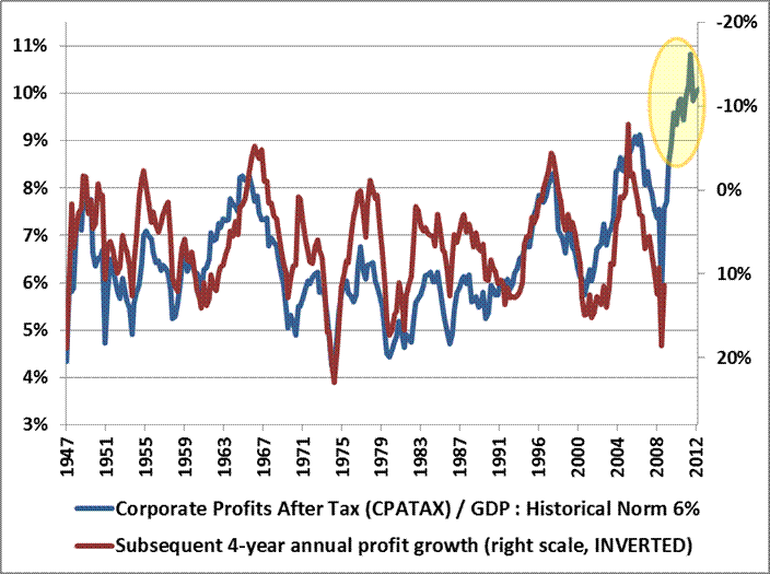
This forecast is also supported by evidence from an analysis of corporate profit margins. In a recent article, John Hussman published a long-term chart of U.S. corporate profits, which demonstrated the magnitude of upward distortion endemic in current corporate profits, which we have reproduced in Chart 1 below. Companies have clearly been benefitting from a period of extraordinary profitability.
Source: John Hussman, 2013
The profit margin picture is critically important. Jeremy Grantham recently stated, "Profit margins are probably the most mean-reverting series in finance, and if profit margins do not mean-revert, then something has gone badly wrong with capitalism. If high profits do not attract competition, there is something wrong with the system and it is not functioning properly." On this basis, we can expect profit margins to begin to revert to more normalized ratios over coming months. If so, stocks may face a future where multiples to corporate earnings are contracting at the same time that the growth in earnings is also contracting. This double feedback mechanism may partially explain why our statistical model predicts such low real returns in coming years. Caveat Emptor.Source: John Hussman, 2013
Modeling Across Many Horizons
Many studies have been published on the Shiller PE, and how well (or not) it estimates future returns. Almost all of these studies apply a rolling 10-year window to earnings as advocated by Dr. Shiller. But is there something magical about a 10-year earnings smoothing factor? Further, is there anything magical about a 10-year forecast horizon?
Kitces (2008, PDF format) demonstrated that "the safe withdrawal rate for a 30-year retirement period has shown a 0.91 correlation to the annualized real return of the portfolio over the first 15 years of the time period". So there is clearly merit in studying a 15-year forecast horizon as well. Further, the tables below will demonstrate that statistical models have the greatest explanatory power at the 15-year horizon.
This study will attempt to address the question of 'perfect forecast horizon', perfect valuation factor, and 'perfect earnings smoothing factor', by analyzing the explanatory power of earnings, the Q-Ratio, and regressed historical stock returns, over return horizons from 1 to 30 years. We will also put all of the factors together to construct an optimized model.
Table 1. below provides a snapshot of some of the results from our analysis. The table shows estimated future returns based on a coherent aggregation of several factor models over some important investment horizons.
Table 1. Factor Based Return Forecasts Over Important Investment Horizons
Source: Shiller (2013), DShort.com (2013), Chris Turner (2013), World Exchange Forum (2013), Federal Reserve (2013), Butler|Philbrick|Gordillo & Associates (2013)
You can see from the table that, according to a model that incorporates valuation estimates from 4 distinct domains, and which explains over 80% of historical returns since 1871, stocks are likely to deliver 1% or less in real total returns over the next 5 to 20 years. Yikes.
Process
The purpose of our analysis was to examine several methods of capturing market valuation to determine which methods were more or less efficacious. Furthermore, we were interested in how to best integrate our valuation metrics into a coherent statistical framework that would provide us with the best estimate of future returns.
Our approach relies on a common statistical technique called linear regression, which takes as inputs the valuation metrics we calculate from a variety of sources, and determines how sensitive actual future returns are to contemporaneous observations of each metric. Linear regression creates a linear function, which by definition can be described by a slope value and an intercept value, which we provide below for each metric and each forecast horizon. A further advantage of linear regression is that we can measure how confident we can be in the estimate provided by the analysis. The quantity we use to measure confidence in the estimates is called the R-Squared.
The following matrices show the R-Squared ratio, regression slope, regression intercept, and current forecast returns based on a regression analysis for each valuation factor. The matrices are heat-mapped so that larger values are reddish, and small or negative values are blue-ish. Click on each image for a large version.
Our approach relies on a common statistical technique called linear regression, which takes as inputs the valuation metrics we calculate from a variety of sources, and determines how sensitive actual future returns are to contemporaneous observations of each metric. Linear regression creates a linear function, which by definition can be described by a slope value and an intercept value, which we provide below for each metric and each forecast horizon. A further advantage of linear regression is that we can measure how confident we can be in the estimate provided by the analysis. The quantity we use to measure confidence in the estimates is called the R-Squared.
The following matrices show the R-Squared ratio, regression slope, regression intercept, and current forecast returns based on a regression analysis for each valuation factor. The matrices are heat-mapped so that larger values are reddish, and small or negative values are blue-ish. Click on each image for a large version.
Matrix 1. Explanatory power of valuation/future returns relationships
Source: Shiller (2013), DShort.com (2013), Chris Turner (2013), World Exchange Forum (2013), Federal Reserve (2013), Butler|Philbrick|Gordillo & Associates (2013)
Matrix 1. contains a few important observations. Notably, over periods of 10-20 years, the Q ratio, very long-term smoothed PE ratios, and market capitalization / GNP ratios are equally explanatory, with R-Squared ratios around 55%. The best estimate (perhaps tautologically given the derivation) is derived from the price residuals, which simply quantify how extended prices are above or below their long-term trend.
The worst estimates are those derived from trailing 12-month PE ratios (PE1 in Matrix 1 above). Many analysts quote 'Trailing 12-Months' or TTM PE ratios for the market as a tool to assess whether markets are cheap or expensive. If you hear an analyst quoting the market's PE ratio, odds are they are referring to this TTM number. Our analysis slightly modifies this measure by averaging the PE over the prior 12 months rather than using trailing cumulative earnings through the current month, but this change does not substantially alter the results.
As it turns out, TTM (or PE1) Price/Earnings ratios offer the least information about subsequent returns relative to all of the other metrics in our sample. As a result, investors should be extremely skeptical of conclusions about market return prospects presented by analysts who justify their forecasts based on trailing 12-month ratios.
The worst estimates are those derived from trailing 12-month PE ratios (PE1 in Matrix 1 above). Many analysts quote 'Trailing 12-Months' or TTM PE ratios for the market as a tool to assess whether markets are cheap or expensive. If you hear an analyst quoting the market's PE ratio, odds are they are referring to this TTM number. Our analysis slightly modifies this measure by averaging the PE over the prior 12 months rather than using trailing cumulative earnings through the current month, but this change does not substantially alter the results.
As it turns out, TTM (or PE1) Price/Earnings ratios offer the least information about subsequent returns relative to all of the other metrics in our sample. As a result, investors should be extremely skeptical of conclusions about market return prospects presented by analysts who justify their forecasts based on trailing 12-month ratios.
Forecasting Expected Returns
We expect you to be skeptical of our unconventional assertions, so below we provide the precise calculations we used to determine our estimates. The following matrices provide the slope and intercept coefficients for each regression. We have provided these in order to illustrate how we calculated the values for the final matrix below of predicted future returns to stocks.
Matrix 2. Slope of regression line for each valuation factor/time horizon pair.
Source: Shiller (2013), DShort.com (2013), Chris Turner (2013), World Exchange Forum (2013), Federal Reserve (2013), Butler|Philbrick|Gordillo & Associates (2013)
Matrix 3. Intercept of regression line for each valuation factor/time horizon pair.
Source: Shiller (2013), DShort.com (2013), Chris Turner (2013), World Exchange Forum (2013), Federal Reserve (2013), Butler|Philbrick|Gordillo & Associates (2013)
For statistical reasons which are beyond the scope of this study, when we solve for future returns based on current monthly data, we utilize the rank in the equation for each metric, not the nominal value.
For example, the 15-year return forecast based on the current Q-Ratio can be calculated by multiplying the current ordinal rank of the Q-Ratio (1171) by the slope from Matrix 2. at the intersection of 'Q-Ratio' and '15-Year Rtns' (-0.000086098), and then adding the intercept at the same intersection (0.119607) from Matrix 3. The result is 0.0188, or 1.88%, as you can see in Matrix 4. below at the same intersection (Q-Ratio | 15-Year Rtns).
Matrix 4. Modeled forecast future returns using current valuations.
Source: Shiller (2013), DShort.com (2013), Chris Turner (2013), World Exchange Forum (2013), Federal Reserve (2013), Butler|Philbrick|Gordillo & Associates (2013)
Chart 2. below demonstrates how closely the model tracks actual future 15-year returns. The red line tracks the model's forecast annualized real total returns over subsequent 15-year periods using our best fit multiple regression model . The blue line shows the actual annualized real total returns over the same 15-year horizon.
Source: Shiller (2011), DShort.com (2011), Chris Turner (2011), World Exchange Forum (2011), Federal Reserve (2011), Butler|Philbrick & Associates (2011)
You can see that 15-year "Regression Forecast" returns are -0.43% per year using market valuations as of February 28, 2013.
Putting the Predictions to the Test
A model is not very interesting or useful unless it actually does a good job of predicting the future. To that end, we tested the model's predictive capacity at some key turning points in markets over the past century or more to see how well it predicted future inflation-adjusted returns.
Table 2. Comparing Long-term average forecasts with model forecasts
Source: Shiller (2013), DShort.com (2013), Chris Turner (2013), World Exchange Forum (2013), Federal Reserve (2013), Butler|Philbrick|Gordillo & Associates (2013)
Observe that, at the very bottom of the bear market in 2009, real total return forecasts never edged higher than 7%, which is only slightly above the long-term average return. This suggests that prices just approached fair value at the market's bottom; they were nowhere near the level of cheapness that markets achieved at bottoms in 1932 or 1982. As of the end of February 2013, annualized future returns over the next 15 years are expected to be less than 0 percent.
We compared the forecasts from our model with what would be expected from using just the long-term average real returns of 6.5% as a constant forecast, and demonstrated that always using the long-term average return as the future return estimate resulted in 350% more error than estimations from our multi-factor regression model over 15-year forecast horizons (1.22% annualized return error from our model vs 5.55% using the long-term average). Clearly the model offers substantially more insight into future return expectations than simple long-term averages, especially near valuation extremes.
Conclusions
The 'Regression Forecast' return predictions along the bottom of Matrix 4. are robust predictions for future stock returns, as they account for over 100 different cuts of the data, using 4 distinct valuation techniques, and utilize the most explanatory statistical relationships. The models explain up to 82% of future returns based on R-Squared, and are statistically significant at p~0. Despite the model's robustness over longer horizons, it is critical to note that even this model has very little explanatory power over horizons less than 6 or 7 years, so the model should not be used as a short-term market-timing tool.
Returns in the reddish row labeled "PE1" in Matrix 4 were forecast using just the most recent 12 months of earnings data, and correlate strongly with common "Trailing 12-Month" PE ratios cited in the media. Matrix 1. demonstrates that this trailing 12 month measure is not worth very much as a measure for forecasting future returns over any horizon. However, the more constructive results from this metric probably helps to explain the general consensus among sell-side market strategists that markets will do just fine over coming years.
Just remember that these analysts have no proven ability whatsoever to predict market returns (see here, here, and here). This reality probably has less to do with the analytical ability of most analysts, and more to do with the fact that most clients would choose to avoid investing in stocks altogether if they were told to expect negative real returns over the long-term from high valuations.
Investors would do much better to heed the results of robust statistical analyses of actual market history, and play to the relative odds. This analysis suggests that markets are currently expensive, and asserts a very high probability of low returns to stocks (and possibly other asset classes) in the future. Remember, any returns earned above the average are necessarily earned at someone else's expense, so it will likely be necessary to do something radically different than everyone else to capture excess returns going forward.
Those investors who are determined to achieve long-term financial objectives should be heavily motivated to seek alternatives to traditional investment options given the grim prospects outlined above. Such investors may find solace in some of the approaches related to 'tactical alpha' that we have described in a variety of prior articles.
Friday, March 8, 2013
Wednesday, February 20, 2013
Balanced Portfolios: Keeping it Real
It's important for clients to understand what they're getting themselves into with a typical balanced portfolio.
The following charts show the distribution of real historical returns over 1, 5, and 10 year horizons for a portfolio consisting of 60% stocks and 40% bonds.
Some facts clients might not be aware of:
Chart 1. Probability of negative real returns to a 60/40 U.S. stock/bond portfolio over 1, 5 and 10 year horizons
Source: Shiller, Federal Reserve
Chart 2. Range of real returns to a U.S. 60/40 stock/bond portfolio over 1, 5, and 10 year horizons
Source: Shiller, Federal Reserve
Chart 3. Frequency distribution of real returns to U.S. 60/40 stock/bond portfolio over rolling 12 month periods
Chart 5. Frequency distribution of real returns to U.S. 60/40 stock/bond portfolio over rolling 10 year (120 month) periods.
Source: Shiller, Federal Reserve
The following charts show the distribution of real historical returns over 1, 5, and 10 year horizons for a portfolio consisting of 60% stocks and 40% bonds.
Some facts clients might not be aware of:
- A balanced portfolio can drop as much as 35% in any given year
- Balanced portfolios have delivered negative real returns over 10 year periods 15% of the time
- Over all rolling 5 year periods, a balanced portfolio has yielded real returns ranging from -10% through +22% annualized
Chart 1. Probability of negative real returns to a 60/40 U.S. stock/bond portfolio over 1, 5 and 10 year horizons
Source: Shiller, Federal Reserve
Chart 2. Range of real returns to a U.S. 60/40 stock/bond portfolio over 1, 5, and 10 year horizons
Source: Shiller, Federal Reserve
Chart 3. Frequency distribution of real returns to U.S. 60/40 stock/bond portfolio over rolling 12 month periods
Source: Shiller, Federal Reserve
Chart 4. Frequency distribution of real returns to U.S. 60/40 stock/bond portfolio over rolling 5 year (60 month) periods
Source: Shiller, Federal ReserveChart 5. Frequency distribution of real returns to U.S. 60/40 stock/bond portfolio over rolling 10 year (120 month) periods.
Source: Shiller, Federal Reserve
Thursday, January 31, 2013
Predicting Markets, or Marketing Predictions
Mark Twain suggested that it is better to remain quiet and be thought a fool, than to open your mouth and remove all doubt.
Would that the 'gurus' who populate the investment and economics landscape would heed Twain's advice. Of course, that will never happen.
We know from studies of expert judgement that gurus who make nuanced predictions and hedge their bets attract much less attention than experts who spin dramatic predictions with unswerving confidence. As a result, firms are predisposed to encourage gurus to voice strong opinions and divergent views that stand out from the crowd. Unfortunately, the qualities that make some gurus more marketable than others are likely to render them less accurate: balanced experts tend to be more accurate than loud ideologues, and their opinions tend to be less damaging when they go wrong.
And even the best experts get it wrong a lot. In fact, they get it wrong more than they get it right. How do we know?
The best and most comprehensive study of expert judgment was performed by Philip Tetlock. In 1985 Tetlock, fascinated by his previous experience serving on political intelligence committees in the early 1980s, set out to discover just how accurate expert forecasters were in their predictions of future events. Over a span of almost 20 years, he interviewed 284 experts about their level of confidence that a certain outcome would come to pass. Forecasts were solicited across a wide variety of domains, including economics, politics, climate, military strategy, financial markets, legal opinions, and other complex domains with uncertain outcomes. In all, Tetlock accumulated an astounding 82,000 forecasts.
This represents an incredible body of evidence about expert judgment, and Tetlock's analysis rendered several astounding conclusions:
Over 14 years, CXO concluded that the average guru's accuracy in calling the direction of the market has been about 47%, or slightly worse than a coin toss. The following chart shows how the accuracy of forecasts has stabilized over time around the 47% mark as the sample size expanded over time. In other words, the experts were less reliable than flipping coins.
Source: CXO Advisory
The evidence does not end there. The following charts, sourced from James Montier's incredibly useful book, Behavioural Investing (2007), show aggregate forecasts from Wall Street's most famous oracles through time, next to the actual trajectory of the forecast variable.
Would that the 'gurus' who populate the investment and economics landscape would heed Twain's advice. Of course, that will never happen.
We know from studies of expert judgement that gurus who make nuanced predictions and hedge their bets attract much less attention than experts who spin dramatic predictions with unswerving confidence. As a result, firms are predisposed to encourage gurus to voice strong opinions and divergent views that stand out from the crowd. Unfortunately, the qualities that make some gurus more marketable than others are likely to render them less accurate: balanced experts tend to be more accurate than loud ideologues, and their opinions tend to be less damaging when they go wrong.
And even the best experts get it wrong a lot. In fact, they get it wrong more than they get it right. How do we know?
The best and most comprehensive study of expert judgment was performed by Philip Tetlock. In 1985 Tetlock, fascinated by his previous experience serving on political intelligence committees in the early 1980s, set out to discover just how accurate expert forecasters were in their predictions of future events. Over a span of almost 20 years, he interviewed 284 experts about their level of confidence that a certain outcome would come to pass. Forecasts were solicited across a wide variety of domains, including economics, politics, climate, military strategy, financial markets, legal opinions, and other complex domains with uncertain outcomes. In all, Tetlock accumulated an astounding 82,000 forecasts.
This represents an incredible body of evidence about expert judgment, and Tetlock's analysis rendered several astounding conclusions:
- Expert forecasts were less well calibrated than one would expect from random guesses
- Aggregated forecasts were better than any individual forecasts, but were still worse than random guesses
- Experts who appeared in the media most regularly were the least accurate
- Experts with the most extreme views were also the least accurate
- Experts exhibited higher forecast calibration outside of their field of expertise
- Among all 284 experts, not one demonstrated forecast accuracy beyond random guesses
In short, experts would have delivered better forecasts by flipping coins. But there was a silver lining.
Tetlock also tracked some simple, rules based statistical models alongside the experts to see if these models would be competitive in terms of forecast calibration. He found that many simple models performed with substantially better calibration than the experts, and delivered accuracy well beyond random chance. Chock another one up for the quants.
You might be wondering whether there are any similar types of studies conducted specifically in the area of financial markets. You're in luck, as there are have been several.
CXO Advisory has been tracking and publishing gurus' forecasts of market direction since 1998. Recently, CXO published a review of all 6,459 forecasts from all of the market 'gurus' that they tracked from 1998 - 2012. Specifically, the gurus were graded on their ability to call the direction of the market, but were not penalized for missing the magnitude of the move.
Over 14 years, CXO concluded that the average guru's accuracy in calling the direction of the market has been about 47%, or slightly worse than a coin toss. The following chart shows how the accuracy of forecasts has stabilized over time around the 47% mark as the sample size expanded over time. In other words, the experts were less reliable than flipping coins.
Source: CXO Advisory
The evidence does not end there. The following charts, sourced from James Montier's incredibly useful book, Behavioural Investing (2007), show aggregate forecasts from Wall Street's most famous oracles through time, next to the actual trajectory of the forecast variable.
Chart 1. Consensus bond yields forecasts 1 year out vs. actual
Chart 2. Consensus S&P500 level 1 year forecasts vs. actual
Chart 3. Consensus S&P500 aggregate earnings 1 year forecasts vs. actual
In all cases the analysts appear to do a noteworthy job of describing what just happened, but appear to have no vision whatsoever about what is about to happen next. This applies to interest rates, the level of stock indices, and aggregate earnings.
Source: Despair.com
Do any experts get it right? What about the experts at the Federal Reserve who are in charge of setting interest rates? Can they predict the magnitude or direction of interest rates just six months hence?
A working paper entitled "History of the Forecasters: An Assessment of the Semi-Annual U.S. Treasury Bond Yield Forecast Survey" (Brooks & Gray, 2003) studied the ability of Federal Reserve economists, including Alan Greenspan, from 1982 - 2002 to discover whether the group of experts that sets interest rates is able to effectively forecast their trajectory through time.
Chart 3.
Source: (Brooks & Gray, 2003)
Again we see a strong talent for describing what has just happened, but no talent whatsoever for predicting what will happen next. Just how poor was the forecasting ability of Fed economists, including sitting Fed Chairman Alan Greenspan, over the 20 year survey?
Chart 4.
Source: (Brooks & Gray, 2003)
The scatter plot above shows how Fed forecasts of interest rates just six months out are negatively correlated with actual outcomes. The r-squared of the regression is 7%, which is not statistically significant, so don't bet the farm against the Fed either. The point is, they can't forecast any better than anyone else.
There is ample evidence that strategists and gurus are unlikely to add much value to the investing process - at least where the goal is to grow your portfolio. Our next article will address another ubiquitous observation in wealth management - overconfidence - and discuss solutions for disillusioned investors looking for a new direction with better odds of success.
Do any experts get it right? What about the experts at the Federal Reserve who are in charge of setting interest rates? Can they predict the magnitude or direction of interest rates just six months hence?
A working paper entitled "History of the Forecasters: An Assessment of the Semi-Annual U.S. Treasury Bond Yield Forecast Survey" (Brooks & Gray, 2003) studied the ability of Federal Reserve economists, including Alan Greenspan, from 1982 - 2002 to discover whether the group of experts that sets interest rates is able to effectively forecast their trajectory through time.
Chart 3.
Source: (Brooks & Gray, 2003)
Again we see a strong talent for describing what has just happened, but no talent whatsoever for predicting what will happen next. Just how poor was the forecasting ability of Fed economists, including sitting Fed Chairman Alan Greenspan, over the 20 year survey?
Chart 4.
Source: (Brooks & Gray, 2003)
The scatter plot above shows how Fed forecasts of interest rates just six months out are negatively correlated with actual outcomes. The r-squared of the regression is 7%, which is not statistically significant, so don't bet the farm against the Fed either. The point is, they can't forecast any better than anyone else.
There is ample evidence that strategists and gurus are unlikely to add much value to the investing process - at least where the goal is to grow your portfolio. Our next article will address another ubiquitous observation in wealth management - overconfidence - and discuss solutions for disillusioned investors looking for a new direction with better odds of success.
Monday, January 7, 2013
Track Records are Rubbish (or Why Managers are Factors in Drag)
As usual, you are the butt of the joke.
Everywhere you turn, you are bombarded with 1, 3, and 5 year track records for investment products. The investment management industry knows that you are influenced by percent symbols preceded by large numbers, so they market products with the best 1, 3 and 5 year track records, prominently featuring them in newspaper and TV advertisements, knowing that you will be unable to resist the urge to chase into those funds to avoid missing another year of riches.
Chart 2. Actual results to mutual fund investors vs. stock and bond benchmarks - 1991 to 2011
Unfortunately, as you probably surmised, this almost never works out. The products with the best track records over the past few years are not the products that deliver the best track records in subsequent years. In fact, there is strong evidence that chasing managers with strong 3 and 5 year track records is actually harmful to your portfolio health. This article will explore the evidence against using a 3 to 5 year track record to make investment decisions, and point to some alternative solutions.
3 Year Track Records Are for Suckers
The most commonly cited study of actual retail investor behaviour is the Dalbar Quantitative Analysis of Investor Behaviour which summarizes findings about mutual fund investor behaviour over the past 20 years. We plucked two important, and we think related, facts from the piece and summarized them in charts 1 and 2 below. Chart 1. shows the average holding period for each class of mutual fund (stocks, bonds and balanced funds), and Chart 2. shows the realized returns to actual investors on their stock and bond mutual fund holdings, over the period 1991 - 2011.
Chart 1. Stock and bond investors hold funds for 3 years; balanced investors give it one more year
Source: Dalbar, 2012
Source: Dalbar
From Chart 1. we can see that, on average, retail investors go chasing into new 'hot funds' about every 3 years or so; balanced investors seem to hang on a little longer, for reasons we explored in this article. Chart 2. highlights the insanity of this approach. Equity investors earned 4% per year less than the large cap stock benchmark over the same period, while bond investors fared even worse. Sure, about half of the decay can be attributed to fees and taxes, and a portion to bad market timing (strangely we didn't receive any calls from investors in a panic to buy in early 2009), but a measurable portion of the lag is due to misguided product selection on the basis of three year track records.
Chart 3., from the annual SPIVA report on active manager performance (2011 version) demonstrates the tendency for managers who demonstrate top quartile performance over a 5 year period to fall out of the top quartile over the next 5 years. One might randomly expect 25% of the managers who rank in the top quartile in the first 5 years to again rank in the top quartile during the second period. In fact, just 6% of these managers actually persist in the top quartile, implying a very substantial reversion to the mean effect.
Chart 3. Mutual fund manager performance persistence over 5 year periods
Source: SPIVA (2012)
Chart 4. shows that institutions act largely on the same schedule as retail investors, with manager termination decisions based largely on 3 to 5 year trailing results. This is not surprising because institutions are run by humans too.
Chart 4. Average evaluation period for manager termination by pension funds
Source: Employee Benefit Research Institute
Chart 5. clearly illustrates the impact of this phenomenon in the pension space. The grey bars represent the average annualized performance of terminated managers in the three years prior to, and three years subsequent to, their termination. The white bars represent the performance of replacement managers in the same years. Clearly institutions are hiring managers with exceptional historical track records over trailing 3 year periods, and firing managers with poor track records. The joke is on the institutions, however, since on average the fired managers go on to outperform the hired managers over the subsequent 1, 2, and 3 year periods!
Chart 5. Excess returns to terminated and newly hired managers in the 3 years prior to, and subsequent to, termination
What an incredibly frustrating reality for retail and institutional investors alike. How can it be that managers with the best track records over as long as 5 years don't work out to be great investments in subsequent years? Does a track record mean anything? For the most part, we don't think so.
Manager Skill, or Factors in Drag?
However, just as value managers were buying their Porsches and brownstones in 2006, their performance streak ended. Over the next 6 years, value managers endured a steady diet of crow while their growth brethren feasted on rich returns. Chart 8. illustrates the same phenomenon for managers with small vs. large-cap biases over a 20 year horizon, but the same effect plays out in all factors: dividend stocks, momentum stocks, low volatility stocks, etc.
It is important to remember that most investment managers are human beings. (I say 'most' because a minuscule but growing portion of managers are actually computers). As such, most managers are really just overconfident, incoherent collections of habits, assumptions, ideologies, and cognitive and emotional biases emanating from the most dangerous black-box of all - the human mind. Sometimes these habits, assumptions and biases are aligned with the market, and the manager does well. Sometimes the manager is 'out of sync', and he does poorly.
In reality, it is better to think of managers as inconsistent conduits to somewhat persistent factors that manifest in markets from time to time to drive outperformance from a certain investment approach. In the equity space, academics suggest that 4 factors explain the majority of long-term stockpicking performance. One might infer that the success or failure of most managers over any period of 3 to 5 years largely depends on whether the manager's biases were aligned with one of the following factors that happened to also be working over the same period.
- Market factor: this is commonly referred to as beta, and refers to the fact that most stocks tend to move in the same direction as the index
- Small-cap factor: it has long been recognized that small-cap stocks outperform large-cap stocks over the long-term
- Value factor: cheap stocks tend to outperform expensive stocks over the long term
- Momentum factor: stocks that have gone up over the past 1 to 12 months tend to outperform over the long term
Recently, academics and practitioners have reluctantly added a low volatility (or low beta) factor to explain the observed outperformance of low volatility stock portfolios, and we will include this factor in our analyses below.
Chart 6. offers graphical evidence of the value and momentum effect within large-capitalization stocks. Specifically, the chart demonstrates how a strategy of rotating into the strongest stocks every month, and a strategy of rotating into the cheapest stocks every year, have outperformed a strategy of holding the broad stock market index since 1927.
Chart 6. U.S. large capitalization stock market value and momentum factor tilt portfolios
Source: Ken French database
It is our assertion that clients should be much less concerned with the track records of individual managers, and much more concerned with the performance of a manager's style factor. If you can identify what factors (or what mix of factors) is most likely to generate the strongest risk-adjusted returns over your rebalance horizon, this information is of much greater value than identifying which managers might outperform their style benchmarks.
This assertion is strongly confirmed by results from Financial Product Differentiation Over the State Space in the Mutual Fund Industry by Li and Qiu (2010), who showed that 95.7% of cross sectional mutual fund performance is explained by the traditional four Carhart factors: market beta, small-cap, value, and momentum.
If 96% of mutual fund performance is explained by style factors, and most managers underperform the market and their style benchmarks, then investors should concentrate on allocating to factors, not managers. In the real world, when the value factor is outperforming, value biased managers will be high-fiving each other at the water cooler and celebrating their unique and robust stock-picking talent. Growth (or anti-value) managers, meanwhile, will be crying in their beer and lamenting the 'broken' market that isn't cooperating with their investment bias. Chart 7. clearly illustrates this effect, as value managers outperformed for the first four years of the last decade, gaining 26% vs. their growth oriented peers by late 2006.
Chart 7. Value vs. Growth: Luck or Skill?
Source: Stockcharts.com
However, just as value managers were buying their Porsches and brownstones in 2006, their performance streak ended. Over the next 6 years, value managers endured a steady diet of crow while their growth brethren feasted on rich returns. Chart 8. illustrates the same phenomenon for managers with small vs. large-cap biases over a 20 year horizon, but the same effect plays out in all factors: dividend stocks, momentum stocks, low volatility stocks, etc.
Chart 8. Small cap vs. Large Cap: Luck or Skill?
Source: Stockcharts.com
If style factors explain 96% of equity manager performance, and a single factor can deliver 25% - 50% or more of outperformance over a four year period, you can see that the decision to allocate to either value or growth, small-cap or large-cap (insert any factor here) completely dominates the decision about which specific value, growth, small-cap or big-cap manager to use.
Surely Buffet is a Special Case, Right? Wrong.
Interestingly, a group at Yale investigated the full trading history of Warren Buffet's investment vehicle, Berkshire Hathaway to discover whether and which systematic factor exposures can effectively explain the seeming miraculous long-term outperformance Buffett has delivered over the years. The authors regressed the monthly returns to Buffet's portfolio (assembled through 13F filings) against the same 5 factors plus another factor, 'Quality', as defined in Asness, Frazzini, and Pedersen (2012b). They discovered that Buffet's strategy was essentially to purchase low beta, high quality stocks (using the long held academic definitions), and lever his portfolio by 60%. The authors regressed Buffet's returns against their 6 factors and then simulated the growth of the equivalent factor portfolio (green line) over Buffet's full investment horizon and compared it to Buffet's actual performance (blue line). The results are in chart 9. below.
Chart 9.
Regarding the ability of factors to explain away Buffet's magical performance streak, the Yale authors suggest:
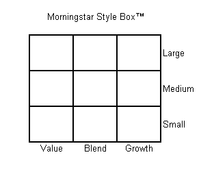
The small-cap and value factors form an integral framework for many institutions, as they are the two dimensions used in a traditional 'style box' model. Investors who are guided by this model seek to gain exposure to each 'style box' by seeking out top managers in each style.
Figure 1. Morningstar's Style Box
Source: Morningstar
In reality, this is just a misguided method of factor investing; misguided because investors just end up with what is essentially a 'market' portfolio in the end, as they own both small and big stocks, and value and growth stocks. Further, 'large cap' and 'growth' are anti-factors, which means they have tended to deliver returns below the market portfolio over the long-term. For this reason (and others that are more nuanced), the style box model should be abandoned in favour of a model that embraces true systematic factor tilts against an efficient 'market portfolio'.
Should We Buy Strong Factors?
We've learned that we should be thinking about allocating to factors instead of managers because managers are just inconsistent factors in drag with a strong propensity to underperform. But how should we think about allocating to factors?
We tested a strategy of rotating into the strongest and weakest factors quarterly based on trailing 1, 3, and 5 year performance to see if any of these approaches work any better than holding an equal-weight portfolio of factor tilts, rebalanced quarterly.
Table 1. Summary of factor rotation strategies
Source: Ken French database, Standard & Poor's, Yahoo finance
We've highlighted the worst performing strategies in red. You can see that a strategy of allocating to the factor that performed the best over the past 3 and 5 year periods delivered the worst absolute and risk-adjusted performance over our sample period (1995 - 2012). In fact, the best approaches would have been to allocate to factors that delivered the worst performance over either the past 1 or 5 years, or to allocate equally to the best and worst factors over the prior 1 year period. A strategy of allocating equally to all factors and rebalancing quarterly delivered similar risk-adjusted returns, but lower absolute returns.
From the table above, we would conclude that there is a weak mean-reversion effect with equity market factors over 1 year and 5 years, and an even weaker momentum effect over a 1 year horizon. Clearly the worst strategies are the ones that are embraced by most investors: buying the strongest performing approach over the past 3 to 5 year period.
Future Directions
From a statistical standpoint, factors don't appear to exhibit either a meaningful momentum or mean reversion signal, so investors really don't have much hope of excess returns from chasing into managers with great track records or backing up the truck on managers with awful track records.
However, both of these dynamics really come down to estimating which factor(s) will deliver the highest returns. If we take the perspective that simple performance offers no meaningful information about future returns, then we are left with optimization alternatives related to relative volatility, such as risk parity, or the covariance matrix, such as minimum variance. We explore these approaches at length in our paper, 'Portfolio Optimization with Factor Tilts', but here is a sneak peak.
Chart 10. 5 Equity Factors, Minimum Variance, Rebalanced Monthly, 25% Filter, Portfolio Target Volatility (1%), Max 100% Exposure
Source: Ken French database, Standard & Poor’s, Yahoo Finance
Chart 11. 5 Equity Factors, Minimum Variance, Rebalanced Monthly, 25% Filter, Portfolio Target Volatility (1% daily), Max 200% Exposure
Source: Ken French database, Standard & Poor’s, Yahoo Finance
Surely Buffet is a Special Case, Right? Wrong.
Interestingly, a group at Yale investigated the full trading history of Warren Buffet's investment vehicle, Berkshire Hathaway to discover whether and which systematic factor exposures can effectively explain the seeming miraculous long-term outperformance Buffett has delivered over the years. The authors regressed the monthly returns to Buffet's portfolio (assembled through 13F filings) against the same 5 factors plus another factor, 'Quality', as defined in Asness, Frazzini, and Pedersen (2012b). They discovered that Buffet's strategy was essentially to purchase low beta, high quality stocks (using the long held academic definitions), and lever his portfolio by 60%. The authors regressed Buffet's returns against their 6 factors and then simulated the growth of the equivalent factor portfolio (green line) over Buffet's full investment horizon and compared it to Buffet's actual performance (blue line). The results are in chart 9. below.
Chart 9.
Regarding the ability of factors to explain away Buffet's magical performance streak, the Yale authors suggest:
Style Boxes Are SillyWe see that Berkshire loads significantly on the [low beta] and [quality] factors, reflecting that Buffett likes to buy safe, high-quality stocks. Controlling for these factors drives the alpha of Berkshire’s public stock portfolio down to a statistically insignificant annualized 0.1%, meaning that these factors almost completely explain the performance of Buffett’s public portfolio.
The small-cap and value factors form an integral framework for many institutions, as they are the two dimensions used in a traditional 'style box' model. Investors who are guided by this model seek to gain exposure to each 'style box' by seeking out top managers in each style.
Figure 1. Morningstar's Style Box
Source: Morningstar
In reality, this is just a misguided method of factor investing; misguided because investors just end up with what is essentially a 'market' portfolio in the end, as they own both small and big stocks, and value and growth stocks. Further, 'large cap' and 'growth' are anti-factors, which means they have tended to deliver returns below the market portfolio over the long-term. For this reason (and others that are more nuanced), the style box model should be abandoned in favour of a model that embraces true systematic factor tilts against an efficient 'market portfolio'.
Should We Buy Strong Factors?
We've learned that we should be thinking about allocating to factors instead of managers because managers are just inconsistent factors in drag with a strong propensity to underperform. But how should we think about allocating to factors?
We tested a strategy of rotating into the strongest and weakest factors quarterly based on trailing 1, 3, and 5 year performance to see if any of these approaches work any better than holding an equal-weight portfolio of factor tilts, rebalanced quarterly.
Table 1. Summary of factor rotation strategies
Source: Ken French database, Standard & Poor's, Yahoo finance
We've highlighted the worst performing strategies in red. You can see that a strategy of allocating to the factor that performed the best over the past 3 and 5 year periods delivered the worst absolute and risk-adjusted performance over our sample period (1995 - 2012). In fact, the best approaches would have been to allocate to factors that delivered the worst performance over either the past 1 or 5 years, or to allocate equally to the best and worst factors over the prior 1 year period. A strategy of allocating equally to all factors and rebalancing quarterly delivered similar risk-adjusted returns, but lower absolute returns.
From the table above, we would conclude that there is a weak mean-reversion effect with equity market factors over 1 year and 5 years, and an even weaker momentum effect over a 1 year horizon. Clearly the worst strategies are the ones that are embraced by most investors: buying the strongest performing approach over the past 3 to 5 year period.
Future Directions
From a statistical standpoint, factors don't appear to exhibit either a meaningful momentum or mean reversion signal, so investors really don't have much hope of excess returns from chasing into managers with great track records or backing up the truck on managers with awful track records.
However, both of these dynamics really come down to estimating which factor(s) will deliver the highest returns. If we take the perspective that simple performance offers no meaningful information about future returns, then we are left with optimization alternatives related to relative volatility, such as risk parity, or the covariance matrix, such as minimum variance. We explore these approaches at length in our paper, 'Portfolio Optimization with Factor Tilts', but here is a sneak peak.
Chart 10. 5 Equity Factors, Minimum Variance, Rebalanced Monthly, 25% Filter, Portfolio Target Volatility (1%), Max 100% Exposure
Source: Ken French database, Standard & Poor’s, Yahoo Finance
Chart 11. 5 Equity Factors, Minimum Variance, Rebalanced Monthly, 25% Filter, Portfolio Target Volatility (1% daily), Max 200% Exposure
Source: Ken French database, Standard & Poor’s, Yahoo Finance
Mutual fund companies and institutional consultants will continue to feed your biases by advertising their best track records, but you don't have to fall for it. With a little research - and an open mind - you can uncover novel methods based on academically validated principles with a proven history of delivering market-beating returns with lower risk.
In our opinion, the most interesting and prospective extension of the concepts discussed above are in the form of Tactical Alpha rather than traditional security selection. This type of approach deals with the allocation of factors across multiple asset classes (see here from AQR[registration required] and here for our own paper), which allows for many more sources of return and diversification, which gets us much closer to investment Nirvana.
Subscribe to:
Posts (Atom)