Monday, January 7, 2013

Track Records are Rubbish (or Why Managers are Factors in Drag)

As usual, you are the butt of the joke.

Everywhere you turn, you are bombarded with 1, 3, and 5 year track records for investment products. The investment management industry knows that you are influenced by percent symbols preceded by large numbers, so they market products with the best 1, 3 and 5 year track records, prominently featuring them in newspaper and TV advertisements, knowing that you will be unable to resist the urge to chase into those funds to avoid missing another year of riches. 

Source: fanpop.com

Unfortunately, as you probably surmised, this almost never works out. The products with the best track records over the past few years are not the products that deliver the best track records in subsequent years. In fact, there is strong evidence that chasing managers with strong 3 and 5 year track records is actually harmful to your portfolio health. This article will explore the evidence against using a 3 to 5 year track record to make investment decisions, and point to some alternative solutions.

3 Year Track Records Are for Suckers

The most commonly cited study of actual retail investor behaviour is the Dalbar Quantitative Analysis of Investor Behaviour which summarizes findings about mutual fund investor behaviour over the past 20 years. We plucked two important, and we think related, facts from the piece and summarized them in charts 1 and 2 below. Chart 1. shows the average holding period for each class of mutual fund (stocks, bonds and balanced funds), and Chart 2. shows the realized returns to actual investors on their stock and bond mutual fund holdings, over the period 1991 - 2011. 

Chart 1. Stock and bond investors hold funds for 3 years; balanced investors give it one more year
Source: Dalbar, 2012

Chart 2. Actual results to mutual fund investors vs. stock and bond benchmarks - 1991 to 2011
Source: Dalbar

From Chart 1. we can see that, on average, retail investors go chasing into new 'hot funds' about every 3 years or so; balanced investors seem to hang on a little longer, for reasons we explored in this article. Chart 2. highlights the insanity of this approach. Equity investors earned 4% per year less than the large cap stock benchmark over the same period, while bond investors fared even worse. Sure, about half of the decay can be attributed to fees and taxes, and a portion to bad market timing (strangely we didn't receive any calls from investors in a panic to buy in early 2009), but a measurable portion of the lag is due to misguided product selection on the basis of three year track records.

Chart 3., from the annual SPIVA report on active manager performance (2011 version) demonstrates the tendency for managers who demonstrate top quartile performance over a 5 year period to fall out of the top quartile over the next 5 years. One might randomly expect 25% of the managers who rank in the top quartile in the first 5 years to again rank in the top quartile during the second period. In fact, just 6% of these managers actually persist in the top quartile, implying a very substantial reversion to the mean effect.

Chart 3. Mutual fund manager performance persistence over 5 year periods
Source: SPIVA (2012)

Chart 4. shows that institutions act largely on the same schedule as retail investors, with manager termination decisions based largely on 3 to 5 year trailing results. This is not surprising because institutions are run by humans too. 

Chart 4. Average evaluation period for manager termination by pension funds

Source: Employee Benefit Research Institute


Chart 5. clearly illustrates the impact of this phenomenon in the pension space. The grey bars represent the average annualized performance of terminated managers in the three years prior to, and three years subsequent to, their termination. The white bars represent the performance of replacement managers in the same years. Clearly institutions are hiring managers with exceptional historical track records over trailing 3 year periods, and firing managers with poor track records. The joke is on the institutions, however, since on average the fired managers go on to outperform the hired managers over the subsequent 1, 2, and 3 year periods!

Chart 5. Excess returns to terminated and newly hired managers in the 3 years prior to, and subsequent to, termination

What an incredibly frustrating reality for retail and institutional investors alike. How can it be that managers with the best track records over as long as 5 years don't work out to be great investments in subsequent years? Does a track record mean anything? For the most part, we don't think so.

Manager Skill, or Factors in Drag?


It is important to remember that most investment managers are human beings. (I say 'most' because a minuscule but growing portion of managers are actually computers). As such, most managers are really just overconfident, incoherent collections of habits, assumptions, ideologies, and cognitive and emotional biases emanating from the most dangerous black-box of all - the human mind. Sometimes these habits, assumptions and biases are aligned with the market, and the manager does well. Sometimes the manager is 'out of sync', and he does poorly.

In reality, it is better to think of managers as inconsistent conduits to somewhat persistent factors that manifest in markets from time to time to drive outperformance from a certain investment approach. In the equity space, academics suggest that 4 factors explain the majority of long-term stockpicking performance. One might infer that the success or failure of most managers over any period of 3 to 5 years largely depends on whether the manager's biases were aligned with one of the following factors that happened to also be working over the same period.

  • Market factor: this is commonly referred to as beta, and refers to the fact that most stocks tend to move in the same direction as the index
  • Small-cap factor: it has long been recognized that small-cap stocks outperform large-cap stocks over the long-term
  • Value factor: cheap stocks tend to outperform expensive stocks over the long term
  • Momentum factor: stocks that have gone up over the past 1 to 12 months tend to outperform over the long term
Recently, academics and practitioners have reluctantly added a low volatility (or low beta) factor to explain the observed outperformance of low volatility stock portfolios, and we will include this factor in our analyses below.

Chart 6. offers graphical evidence of the value and momentum effect within large-capitalization stocks. Specifically, the chart demonstrates how a strategy of rotating into the strongest stocks every month, and a strategy of rotating into the cheapest stocks every year, have outperformed a strategy of holding the broad stock market index since 1927.

Chart 6. U.S. large capitalization stock market value and momentum factor tilt portfolios

Source: Ken French database

It is our assertion that clients should be much less concerned with the track records of individual managers, and much more concerned with the performance of a manager's style factor. If you can identify what factors (or what mix of factors) is most likely to generate the strongest risk-adjusted returns over your rebalance horizon, this information is of much greater value than identifying which managers might outperform their style benchmarks.

This assertion is strongly confirmed by results from Financial Product Differentiation Over the State Space in the Mutual Fund Industry by Li and Qiu (2010), who showed that 95.7% of cross sectional mutual fund performance is explained by the traditional four Carhart factors: market beta, small-cap, value, and momentum.

If 96% of mutual fund performance is explained by style factors, and most managers underperform the market and their style benchmarks, then investors should concentrate on allocating to factors, not managers. In the real world, when the value factor is outperforming, value biased managers will be high-fiving each other at the water cooler and celebrating their unique and robust stock-picking talent. Growth (or anti-value) managers, meanwhile, will be crying in their beer and lamenting the 'broken' market that isn't cooperating with their investment bias. Chart 7. clearly illustrates this effect, as value managers outperformed for the first four years of the last decade, gaining 26% vs. their growth oriented peers by late 2006.

Chart 7. Value vs. Growth: Luck or Skill?
Source: Stockcharts.com

However, just as value managers were buying their Porsches and brownstones in 2006, their performance streak ended. Over the next 6 years, value managers endured a steady diet of crow while their growth brethren feasted on rich returns. Chart 8. illustrates the same phenomenon for managers with small vs. large-cap biases over a 20 year horizon, but the same effect plays out in all factors: dividend stocks, momentum stocks, low volatility stocks, etc.


Chart 8. Small cap vs. Large Cap: Luck or Skill?
Source: Stockcharts.com

If style factors explain 96% of equity manager performance, and a single factor  can deliver 25% - 50% or more of outperformance over a four year period, you can see that the decision to allocate to either value or growth, small-cap or large-cap (insert any factor here) completely dominates the decision about which specific value, growth, small-cap or big-cap manager to use.

Surely Buffet is a Special Case, Right? Wrong.


Interestingly, a group at Yale investigated the full trading history of Warren Buffet's investment vehicle, Berkshire Hathaway to discover whether and which systematic factor exposures can effectively explain the seeming miraculous long-term outperformance Buffett has delivered over the years. The authors regressed the monthly returns to Buffet's portfolio (assembled through 13F filings) against the same 5 factors plus another factor, 'Quality', as defined in Asness, Frazzini, and Pedersen (2012b). They discovered that Buffet's strategy was essentially to purchase low beta, high quality stocks (using the long held academic definitions), and lever his portfolio by 60%. The authors regressed Buffet's returns against their 6 factors and then simulated the growth of the equivalent factor portfolio (green line) over Buffet's full investment horizon and compared it to Buffet's actual performance (blue line). The results are in chart 9. below.


Chart 9. 


Regarding the ability of factors to explain away Buffet's magical performance streak, the Yale authors suggest:

We see that Berkshire loads significantly on the [low beta] and [quality] factors, reflecting that Buffett likes to buy safe, high-quality stocks. Controlling for these factors drives the alpha of Berkshire’s public stock portfolio down to a statistically insignificant annualized 0.1%, meaning that these factors almost completely explain the performance of Buffett’s public portfolio.
Style Boxes Are Silly

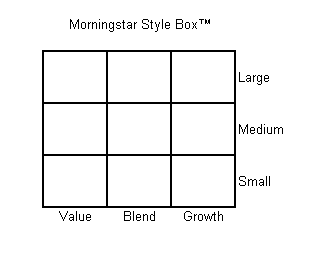
The small-cap and value factors form an integral framework for many institutions, as they are the two dimensions used in a traditional 'style box' model. Investors who are guided by this model seek to gain exposure to each 'style box' by seeking out top managers in each style.


Figure 1. Morningstar's Style Box

Source: Morningstar

In reality, this is just a misguided method of factor investing; misguided because investors just end up with what is essentially a 'market' portfolio in the end, as they own both small and big stocks, and value and growth stocks. Further, 'large cap' and 'growth' are anti-factors, which means they have tended to deliver returns below the market portfolio over the long-term. For this reason (and others that are more nuanced), the style box model should be abandoned in favour of a model that embraces true systematic factor tilts against an efficient 'market portfolio'.


Should We Buy Strong Factors?


We've learned that we should be thinking about allocating to factors instead of managers because managers are just inconsistent factors in drag with a strong propensity to underperform. But how should we think about allocating to factors?


We tested a strategy of rotating into the strongest and weakest factors quarterly based on trailing 1, 3, and 5 year performance to see if any of these approaches work any better than holding an equal-weight portfolio of factor tilts, rebalanced quarterly.


Table 1. Summary of factor rotation strategies

Source: Ken French database, Standard & Poor's, Yahoo finance

We've highlighted the worst performing strategies in red. You can see that a strategy of allocating to the factor that performed the best over the past 3 and 5 year periods delivered the worst absolute and risk-adjusted performance over our sample period (1995 - 2012). In fact, the best approaches would have been to allocate to factors that delivered the worst performance over either the past 1 or 5 years, or to allocate equally to the best and worst factors over the prior 1 year period. A strategy of allocating equally to all factors and rebalancing quarterly delivered similar risk-adjusted returns, but lower absolute returns.


From the table above, we would conclude that there is a weak mean-reversion effect with equity market factors over 1 year and 5 years, and an even weaker momentum effect over a 1 year horizon. Clearly the worst strategies are the ones that are embraced by most investors: buying the strongest performing approach over the past 3 to 5 year period.


Future Directions


From a statistical standpoint, factors don't appear to exhibit either a meaningful momentum or mean reversion signal, so investors really don't have much hope of excess returns from chasing into managers with great track records or backing up the truck on managers with awful track records. 


However, both of these dynamics really come down to estimating which factor(s) will deliver the highest returns. If we take the perspective that simple performance offers no meaningful information about future returns, then we are left with optimization alternatives related to relative volatility, such as risk parity, or the covariance matrix, such as minimum variance. We explore these approaches at length in our paper, 'Portfolio Optimization with Factor Tilts', but here is a sneak peak. 


Chart 10. 5 Equity Factors, Minimum Variance, Rebalanced Monthly, 25% Filter, Portfolio Target Volatility (1%), Max 100% Exposure

Source: Ken French database, Standard & Poor’s, Yahoo Finance

Chart 11. 5 Equity Factors, Minimum Variance, Rebalanced Monthly, 25% Filter, Portfolio Target Volatility (1% daily), Max 200% Exposure

Source: Ken French database, Standard & Poor’s, Yahoo Finance

Mutual fund companies and institutional consultants will continue to feed your biases by advertising their best track records, but you don't have to fall for it. With a little research - and an open mind - you can uncover novel methods based on academically validated principles with a proven history of delivering market-beating returns with lower risk.

In our opinion, the most interesting and prospective extension of the concepts discussed above are in the form of Tactical Alpha rather than traditional security selection. This type of approach deals with the allocation of factors across multiple asset classes (see here from AQR[registration required] and here for our own paper), which allows for many more sources of return and diversification, which gets us much closer to investment Nirvana.

Thursday, January 3, 2013

The Full Montier: Absolute vs. Relative Value

James Montier, one of our favourite thinkers and fellow evangelist for behavioural economics and evidence based investing, published a great report last year entitled, "I Want to Break Free, or, Strategic Asset Allocation ≠ Static Asset Allocation". The piece is a tour de force against the ubiquitous concept of "Strategic Asset Allocation" (SAA) which argues that investors should set an asset allocation at the start of their investment horizon that theoretically balances individual risk tolerance against long-term average market risks, and then regularly rebalance back to this target allocation.

As we have argued many times in this blog, traditional SAA is hamstrung because there is no mechanism to alter the asset allocation given changes in relative expected returns and risks from each asset class over time. Inconceivably, adherents to this approach would have advocated exactly the same mix of stocks and bonds in December 1999, when stocks were as overvalued as they had ever been in history, as they would have advocated in 1982 when stocks were dirt cheap. We have argued, and Montier apparently concurs, that investors should be constantly aware of whether prospective returns to stocks are high or low, and alter asset allocations accordingly through time.


Montier is a die-hard value investor, so he views prospective returns through this lens. He asserts that investors should only invest in markets when they offer the prospect of reasonable future real returns on the basis of reasonable valuations, and they should avoid markets when they offer low returns. While this seems eminently reasonable, in practice this logic can be very difficult for investors to adhere to because markets can continue to get more and more expensive (or cheaper) for many years, and investors often find it difficult to stand on the sidelines and watch the market shoot into the stratosphere. For example, markets entered a period of extreme valuation by many measures in 1994 and continued to push higher for 6 more years before finally succumbing to valuation levels that were, by some measures, more than twice as high as any other period in history.


For this reason, most wealth managers, institutions, and advisors practice Strategic Asset Allocation, which keeps investors fully invested in their target mix of stocks and bonds at all times. Where active bets are taken in pursuit of better performance, they take the form of relative value approaches where individual securities are selected for portfolios because they have lower valuations than their peers. This approach is starkly different than the absolute value approach described in the previous paragraph because with the absolute value approach, an investor will hold cash when no investments offer strong absolute returns, whereas relative value investors will always be fully invested, even when all investments are expensive and offer low returns.


Absolute Value: A Few Tests


We thought it would be fun to test an absolute value approach per Montier's prescription using our favorite long-term stock-market data source, Shiller's database. The following charts illustrate how an absolute return investor might have fared had he chosen to move out of stocks and into cash where the real absolute valuation of the stock market ended the prior month below a certain threshold. For ease, we chose the cyclically adjusted earnings yield as the valuation metric, which is just the reciprocal of the Shiller PE. We then adjusted the yield value for the realized year-over-year inflation rate to find the real earnings yield. Finally, we used an 'expanding window' approach to find the percentile rank of the real earnings yield to eliminate as much lookahead bias as possible.


Note that because we are using real earnings yield rather than nominal earnings yield, markets can get cheap or expensive in three ways:


  • changes in inflation
  • changes in earnings
  • changes in price
As a result, while markets would appear to be quite expensive today based on nominal earnings yield, which is in the top quintile of all values over the past 140 years, the real earnings yield is less extreme because yoy inflation is so low. Should inflation pick up, the real earnings yield will decline, all else equal, which would alter the current state of our model (in stocks or in cash). 


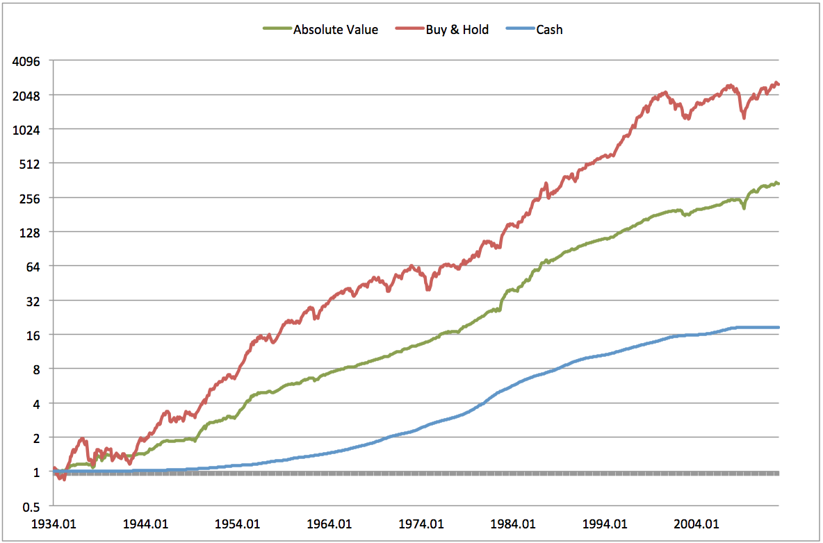
Chart 1. Valuation based asset allocation: own S&P500 when valuation < long-term average, otherwise hold cash

Source: Shiller (2012), Federal Reserve

Using the expanding window approach, an investor would have spent about 80% of months in cash over the past 80 years or so, implying a fairly consistent expansion in PE ratios over time (we identify periods where market valuations are above our threshold with grey areas on the chart). Even so, by investing in markets only when they are truly cheap (> median real earnings yield) and holding cash otherwise, investors would have generated about 70% of the total return to stocks with less than half the volatility and 73% lower drawdowns since 1934. The reduction in drawdowns is especially important in the context of Montier's definition of risk: the permanent impairment of capital.


We know from history however that when markets move from being inexpensive up through fair value, they usually move well into the range of 'overvalued' before peaking. If that's the case, investors might choose to hold onto stocks until they move further into the expensive range. Chart 2. shows the performance of a strategy that holds stocks unless they are in the top quintile of valuations (bottom quintile of real earnings yields), and holds cash otherwise.


Chart 2. Valuation based asset allocation: own S&P500 when valuation < 80th percentile, otherwise hold cash

Source: Shiller (2012), Federal Reserve

By tolerating higher, but not extreme, valuations investors would have achieved higher returns than the markets overall (11.4% vs. 10.4%) with 26% less volatility and 40% lower drawdowns. As a result, the Sharpe ratio of this approach was 0.8 vs. 0.51 for buy & hold.


A more coherent approach to this framework might eliminate the absolute threshold entirely in favour of a scaled approach. For example, an investor might hold stocks in proportion to the percentile rank of the real earnings yield, and hold the balance in cash. For example when the real earnings yield is at the 80th percentile, the investor would hold 80% stocks and the balance of 20% in cash. Conversely, when stock earnings yields are at the 20th percentile, he would own 20% stocks and 80% cash. Again, this measure is based on valuations at the prior month's close, and using an expanding window to avoid lookahead bias. Chart 3. shows the results of this approach.


Chart 3. Valuation based asset allocation: own S&P500 in proportion to the percentile value of real earnings yield (hold balance in cash)

Source: Shiller (2012), Federal Reserve

This coherent approach avoids having to choose a cutoff threshold, which makes it more robust. Further, the Sharpe ratio is almost as high as for the model with an 80th percentile threshold, though in this case it is because of very low average volatility (5.1% vs. 9.6%), as the returns are considerably lower.


Lastly, we wondered how the same approach would have worked if instead of allocating to cash, we allocated to Treasuries. Chart 4. gives us the answer.


Chart 4. Valuation based asset allocation: own S&P500 in proportion to percentile value of real earnings yield (hold balance in Treasuries).

Source: Shiller (2012), Federal Reserve

Future Directions


James Montier is incensed by the ubiquitous calibration of strategic asset allocation with 'static' asset allocation because static allocation makes no accommodation for the fact that market valuations and commensurate expected returns fluctuate dramatically over time. Does it make sense for investors to be mostly indifferent to expected returns in setting their asset allocation targets?


In keeping with Montier's absolute value philosophy, we investigated several dynamic allocation strategies based on reducing or eliminating exposure to markets as they get more or less expensive, using the real earnings yield as our yardstick. In every case we tested the absolute value based approach delivered a higher Sharpe ratio, and a much higher ratio of returns to our approximation of Montier's measure of risk - maximum drawdowns.


The primary challenge with these approaches is that they require adherents to exit markets just as the party gets going into major peaks. Major market peaks manifest in the midst of extreme optimism and enthusiasm about the future which sweeps every last investor dollar into stocks over several euphoric years. It takes extreme fortitude to stand aside in cash during these long periods of parabolic market gains, and we know from the published studies in behavioural finance that most investors will buckle and go all-in just before the market peaks and rolls over.


Investment managers that adhere to this type of approach will suffer enormous career risks during these periods, and lose a large portion of their assets under management. Montier's current firm, GMO, admits to losing over 40% (!!) of total client assets in the several years leading up to the 2000 market peak, and John Hussman has experienced similar investor attrition over the last few years as his valuation models have kept him largely on the sidelines during the market's current bull market run. To paraphrase Keynes 'The markets can stay irrational longer than you can keep clients.'


We believe that successful investment management involves two key elements: 


  1. Systematically apply an evidence based approach to investments that maximizes return with minimal risk
  2. All else equal, and with a clear understanding of investors' behavioural flaws, apply a strategy with the highest probability that investors will stick with it over time
    • avoid large drawdowns to reduce emotional decision making based on fear
    • participate in major bull markets to reduce emotional decision making based on greed
There are several approaches that embrace these two broad qualities, but our preference is toward strategies that leverage momentum and volatility management. These techniques are practiced with demonstrable results by the best trend following managers, but we'd like to think our Adaptive Asset Allocation program represents another attractive alternative.


Wednesday, December 19, 2012

Don't Take Our Word For It


"It is difficult to get a man to understand something, when his salary depends upon his not understanding it!" Upton Sinclair

Long-time readers will know that we periodically publish a statistical forecast for U.S. stock market returns over horizons from 5 to 30 years, which we generate from a variety of long-term valuation metrics. We were motivated to conduct this analysis because we observed an enormous amount of misunderstanding and misinformation in estimates quoted in various media sources, which largely serve to protect the interests of equity managers and investment firms whose livelihood relies on equity enthusiasm.

A handful of trustworthy buy-side firms consistently publish similar forecasts based on their own analyses, and there has been a flurry of reports lately, so we thought we would summarize the findings of others who have investigated this topic so that readers don't have to just take our word for it.

Chart 1. below summarizes the forecasts of several firms or independent analysts based on papers published in the last month or so. Since few investors invest purely in stocks, we used large cap stock market forecasts as well as the current yield on the Barclays U.S. Aggregate Bond Index, and the most recent inflation expectations reading from the Cleveland Fed's model to create a real forecast for a U.S. 60/40 balanced portfolio. AQR actually published a balanced fund forecast independent of its stock market forecast, so we used their estimate directly.

Chart 1. Forecast total real returns to a U.S. 60/40 balanced portfolio over the next 7-10 years, annualized

Sorry folks, but good stock picking won't meaningfully alter this conclusion. But don't lose hope - we may have an answer.


The following reports were sources for Chart 1, and we would encourage you to read them all.

GMO forecast

AQR forecast

Hussman forecast

Gray forecast

Pimco forecast

BPG forecast

Monday, December 3, 2012

Tactical Alpha: The Case for Active Asset Allocation

Patients with certain brain injuries often do not recognize their own limbs on one side of their body; they often wake up alarmed at the presence of an arm or leg in the bed next to them on one side of their body, which they do not recognize as their own. The name of this condition is hemispatial neglect, and it pertains to a person's awareness about one half of their field of view. Sufferers also often ignore words on one side of a page, eat the food only on one side of their plate, or render incomplete drawings of objects or faces.

The human brain is an incredible puzzle, but conditions like this may offer clues to the mystery of why investors systematically ignore over half of the opportunity to earn excess returns in markets. Despite countless studies showcasing the absence of persistent alpha in the security selection domain, and the overwhelming improbability of identifying alpha generators in advance, the vast majority of active investors continue to flock to traditional active management in pursuit of elusive excess returns.

Meanwhile, most investors remain inconceivably blind to the opportunity to generate excess returns through the other half of the active investment space - active asset allocation - despite a growing body of research suggesting this approach may be a source of substantial untapped 'tactical alpha'.

Many investors perceive that the opportunity to generate incremental excess returns is much higher in the security selection space than the asset allocation space because there are vastly more securities (i.e. stocks and bonds) than there are asset classes (i.e. stock markets and bond markets). This perception influences the relative priority placed on the pursuit of alpha from active security selection, relative to active asset allocation. This article will address this imbalance and provide compelling evidence that equal priority (at least) should be placed on generating excess returns from asset allocation, even at the expense of sacrificing active security selection.

For most institutions, the asset allocation decision and the security selection decision embody a tradeoff. This is due to the structural frictions embedded in the use of external managers employed  in an attempt to 'beat the benchmark' through active security selection in a specific market.

Unfortunately, institutional investors' ability to move dynamically in and out of asset classes is constrained by the allocation and redemption policies of these traditional investment managers, such that agile rotation among and between markets and asset classes is difficult on shorter term horizons of, say, less than one year. For this reason, institutions that embrace the ability of managers to deliver alpha through security selection will necessarily sacrifice their ability to extract value from a more dynamic asset allocation process.

Market inefficiencies exist for a variety of reasons, such as asymmetric information, tax frictions, and emotional biases, but perhaps the most economically significant inefficiencies stem from structural constraints imposed on a large segment of investors.  We view the structural bias in favour of security selection alpha vs. tactical alpha as an important example of this type of constraint. As a result, we assert that tactical alpha - active asset allocation - represents one of the most economically important sources of excess returns available to investors in public markets.

The next sections will review salient research contributions in the field of performance attribution related to active asset allocation versus active security selection. Our objective is to demonstrate the importance of active asset allocation as a source of potential excess returns, and persuade progressive investors to allocate more capital and resources to this objective, even if that means scaling back their commitment to the pursuit of traditional sources of alpha. 

We will also add to the existing research with a novel examination of the unconstrained potential to extract excess returns from asset allocation vs. security selection using a normative quantitative approach.

Shoulders of Giants

Most studies in this area focus on analysis of pension funds and mutual funds, and explore the degree to which total portfolio return is explained by deviations from an institutions' policy asset class weights. Portfolio returns are the aggregation of the returns to the policy portfolio and 'active returns', which in most studies is defined as the residual not accounted for by the policy portfolio.

For example, Brinson regressed monthly portfolio total returns for pension funds against the monthly returns to each funds' policy portfolio, and determined that the policy portfolio explains 90% of the monthly variability in total returns. While this analysis is helpful, as it illustrates the impact of asset allocation on long-term portfolio performance, it does not allow us to determine the underlying factors that drive the unexplained 10% of returns. Further, it was highlighted by future studies, including the Kaplan study we describe below, that in fact the majority of monthly pension fund performance can be explained by the fund's decision to invest in capital markets at all, vs. holding cash.

Kaplan and Ibbotson added a second dimension to the analysis by exploring the degree to which fund policy weights explained the cross-sectional differences in total returns across a basket of funds over a ten year investment period. The purpose of the cross sectional analysis was to analyze the degree to which differences in policy weights explained the difference in the total return between funds. They discovered that asset allocation policy explained 40% of the difference in the total return across funds over the full period, and asserted that the residual difference was some combination of, "asset class timing, style within asset classes, security selection, and fees", and that for pension funds it was also attributable to manager selection.

Many people thought that the Brinson studies analyzed the proportion of fund total performance that was attributable to each funds' policy portfolio weights, rather than analyzing the proportion of fund variance. Kaplan and Ibbotson answered this question too, using the original Brinson data as well as the data from their own later studies. Table 1  summarizes their results.

Table 1. Percentage of Total Return Level Explained by Policy Return

Source: Kaplan and Ibbotson (2000)

The average across all studies is 104%. Some readers may find this measure confusing. How can asset allocation explain greater than 100% of total returns?

Remember that the total return to the funds in the studies was equal to the sum of the total return to the funds' policy portfolio using asset class benchmarks, plus the active return, minus trading frictions. So the results of this study demonstrate that, over the periods studied in the analyses, the average institutional investor lost 4% of total return to fees, ineffective active management, or poor manager selection. Given the asset allocation constraints on most institutions, the vast majority of this return decay was a result of poor security selection.

This begs the questions:
  • Why do investors continue to seek excess returns from active security selection?
  • Is there another source of active returns
Free from Constraints

Unfortunately, neither the Brinson nor the Kaplan/Ibbotson studies explored the degree to which the variability of returns was due to active asset allocation bets versus active security selection bets. Fortunately, Assoé, L'Ehr and Plant [ALP] (2006) performed an analysis, modeled after Kritzman and Page (2003), that applied a creative approach to answer this exact question. ALP used a normative framework rather than an empirical framework like that embraced by Brinson, Ibbotson and Kaplan, in which the potential returns in each quarterly period from 1985 - 2005 were explored for a large set of constrained, randomly generated asset class portfolios and security portfolios.

In the ALP analysis, benchmark weights were assigned for a theoretical fund that included cash (5%), bonds (30%), stocks (40%), real estate (10%), private equity (10%), and commodities (5%). At the start of each annual period, 100 draws were made from the asset pool according to the above proportions, with each draw representing 1% of the final portfolio for that year. The returns to the random portfolio are then computed for each quarter of the subsequent year, after which a new random portfolio is constructed in the same way for each year from 1985 through 2005. Then this process is repeated 10,000 times, with each repetition representing one sample portfolio.

The purpose of this procedure is to generate a large sample of possible portfolios generated exclusively from small changes to the asset allocation around prescribed weights. To this end the dispersion of portfolio returns is due exclusively to changes in the asset allocation, as opposed to the other variables cited in the Kaplan and Ibbotson study.

A similar procedure is used  to generate stock portfolios from a long-term S&P 500 stock dataset. In this case stock portfolios are created at the start of each year by randomly selecting 100 stocks, where any given stocks' probability of inclusion at each random draw is equal to the stocks' current weight in the index. This procedure is also repeated 10,000 times over the entire 20 year investment period.

Chart 1. describes the dispersion between the 95th and 5th percentile portfolios in each quarter over the investment horizon for the asset allocation portfolios and the stock selection portfolios. Note that the paper asserts that the average annualized dispersion between 95th and 5th percentile portfolios over the entire sample is equivalent for asset allocation and security selection, suggesting that in aggregate asset allocation and security selection provide equal opportunities to add value in an active portfolio management process.

Chart 1. Relative importance of asset allocation and security selection: difference between the 5th and 95th percentile quarterly performance
Source: Assoé, L'Ehr and Plant (2006)

ALP suggest that the results above reveal 3 important takeaways from the analysis. Directly from the paper:
  1. the relative importance of asset allocation and security selection is time-dependent;
  2. the asset allocation driven dispersion is more volatile than the security selection induced dispersion
  3. the security selection activity generates as much dispersion in active return as asset allocation so that it cannot be unequivocally declared that one activity is structurally more or less important than the other

We would add a few other observations from this analysis. First, the paper deliberately constrains the allocations to the six asset classes by weighting them in the asset 'pool' according to a typical institutional weighting scheme. While this assumption is consistent with the decision-making latitude of traditional institutions, which are dominated by traditional consulting relationships, it does not allow the analysis to account for the full opportunity set offered by an unconstrained asset allocation decision, such as the opportunity set available to CTAs or unconstrained asset allocators seeking tactical alpha.

Second, the equity weights are constrained by weighting them in the equity 'pool' according to the market cap weighting in the S&P500. True active managers, especially outside the traditional mutual fund space, would take considerably more latitude in selecting stocks, and even traditional managers are beginning to accept the large amount of research demonstrating the long-term superiority of an equal weight basket over the typical market capitalization weighted approach.

Third - and this is the major focus of the rest of this article - the authors do not seek to explore the cause of the time-varying nature of the relative value of asset allocation vs. security selection. From Chart 1 we can see that at times the asset allocation contribution dominates the contribution of security selection, while at other times the reverse is true. What are the driving forces behind these time-varying shifts?

Asset Allocation or Security Selection: An Answer

Initially, our curiosity was peaked by  This field has been plowed thoroughly over the years, first by Brinson et al., and later by Ibbotson and Kaplan, among others, but these pioneers left several important unanswered questions that the Staub and Singer article addressed.

This question is addressed by Staub and Singer in a paper entitled, 'Asset Allocation vs. Security Selection: Their Relative Importance', published in the CFA Journal (2011). The following is from the abstract:
Various researchers have investigated the importance of asset allocation versus security selection. Although we think this question is conceptually weak—because asset allocation and security selection have different missions—we address it to ensure appropriate quantitative treatment. We focus on feasibility rather than on what managers actually do. Hence, our approach is free of benchmark thinking and makes no assumptions regarding portfolio positions or potential constraints.
We have emphasized the final sentence because it addresses the issues we raised above regarding the constraints applied in the ALP paper.

At core, Staub and Singer assert that the only information required to determine the contribution of any asset class to standardized portfolio returns is the correlation matrix. This is because the magnitude of contribution is purely a function of leverage; an asset with a low ambient volatility can be scaled up and down at will. As such, the authors examine a correlation matrix composed of the following levels of grouping:
  1. The investment decision: invest in risky assets vs. holding cash
  2. Asset classes
  3. Geographic markets within each asset class
  4. Securities within each geographic market
Note that the decision to invest in risk assets vs. cash invokes the basket of risky assets, which in turn consists of different geographic markets within each asset class. Finally, each market contains individual securities. In this way, each layer of portfolio decision has a cascading impact on more granular sets of assets down the chain.

Further, the authors assume the following:
  • There are 20 independent stock markets and 20 independent bond markets
  • Each independent market is composed of 100 securities
Broadly, this decision tree describes the opportunity set for most large institutions, at least among the portion of their portfolios that is allocated to traditional asset classes (stocks and bonds). 

Finally, the paper establishes stable correlation estimates between each security category and market, which quantify the impact of decisions in one layer on the constituents of other layers of the investment process.

• stocks in a national market have a correlation of 0.50,
• bonds in a national market have a correlation of 0.80,
• stocks of different national markets have a correlation of 0.40,
• bonds of different national markets have a correlation of 0.60,
• stocks and bonds of the same national market have a correlation of 0.30, and
• stocks and bonds of different national markets have a correlation of 0.20.

With these assumptions in place, the authors use a powerful statistical technique (Principal Component Analysis) to identify the explanatory power of each dimension of standardized portfolio returns, with the following results:

Chart 2. Cumulative eigenvalues for 'layers' of investment decisions
Source: Staub and Singer, 2011

You can see that, with the authors' correlation assumptions, 65% of potential portfolio standardized returns are explained in aggregate by the investment vs. cash decision; the asset allocation decision; and the market selection decision. The remaining 35% is derived from individual security selection decisions.

The Impact of Changing Correlations

The Staub and Singer paper offers a clue about what drives the time varying nature of the relative importance of asset allocation and security selection observed in the ALP paper: the relative correlation between assets, markets, and securities. But of course correlations are not static, as implied in Staub and Singer.

Our contribution to this discussion then, is an analysis of how changes in the correlations between asset classes (stock and bond markets), and between individual securities, affects their relative contribution to portfolio returns.

To perform this analysis, we used exactly the same procedure as laid out in Staub and Singer, except that we repeated the analysis for a variety of different estimates of correlation. We focused specifically on how the standardized portfolio return attribution changed as we changed the correlation between stock and bond markets, and varied the correlation between individual stocks, on a domestic market.

In contrast with ALP, and consistent with Staub and Singer, we applied no constraints to the analysis. An unconstrained analysis more effectively reveals the true opportunity set available to managers who pursue tactical alpha as well as traditional alpha.

We varied the correlation between domestic stocks and bonds from -1 to 1 to reflect the fact that stocks and bonds are sometimes highly correlated, sometimes highly negatively correlated, and sometimes exhibit no correlation at all, as evidenced by Chart 3. In contrast, domestic stocks do not in practice ever exhibit average correlations less than 0 (see Chart 4.), so we varied this coefficient between 0 and 1.

Chart 3. 60-day rolling correlation between stocks and bonds
Source: Yahoo finance

Chart 4. Implied correlation between S&P 500 stocks
Source: CBOE

Matrix 1. below reproduces the Straub and Singer analysis for each stock/bond and stock/stock correlation combination along the spectrum for each described above. For clarity, the number in each cell equates to the total amount of standardized portfolio variance that is cumulatively attributable to the invest/cash, asset class, and market choice opportunities. The balance (1 - the percentage in the cell) is attributable to the security selection opportunity. 

Matrix 1. Sensitivity of potential standardized return attribution from active asset allocation vs. active security selection to changes in correlation estimates
Source: Butler|Philbrick|Gordillo & Associates, JP Belanger (Quantum Financier)


We highlighted two values in circles: the green circle highlights the value that corresponds with current measures for stock/bond and stock/stock correlations per Charts 3. and 4. Note that at current estimates for intra- and inter-market correlations, about 73% of potential portfolio variance is explained by asset allocation. The red circle corresponds to the long-term average measures for the same correlations over the 2004-2012 period, again per Charts 3 and 4., suggesting that on average asset allocation accounts for 69% of potential alpha, while security selection offers just 31%.

From Charts 3. and 4. above, and corresponding cells in Matrix 1. below, it would therefore appear that we are currently entrenched in a period where the asset allocation decision is of measurably greater importance than it has proven to be historically.

Future Directions

As discussed in the opening paragraph of this article, the question of whether to seek value from active asset allocation or traditional security selection is not a trivial one. This is because the decision to seek value through security selection is usually carried out through allocation to external managers with specialization in certain markets or assets. In order to carry out their active investment management process, these managers require that capital be committed for meaningful periods. 

Unfortunately, this runs counter to the need for agility in asset allocation required to derive value from tactical asset allocation efforts.

This survey of asset allocation / security selection studies, and our group's own contribution to this important domain, serves to illustrate the relative importance of asset allocation in the pursuit of incremental risk-adjusted returns. Further, most institutions face structural, inertial and regulatory impediments to the implementation of meaningful asset allocation program. This means that there is a very large and economically significant opportunity for open-minded institutions that are willing to deviate from the status quo.

Investors who are interested in exploring active asset allocation strategies are invited to explore the following articles and papers:
__________________________
Links to other websites or references to products, services or publications other than those of Macquarie Private Wealth Inc.(MPW) on this website do not imply the endorsement or approval of such websites’ products, services or publications by MPW. MPW makes no representations or warranties with respect to, and is not responsible or liable for, these websites’ products, services or publications. Macquarie Private Wealth Inc. is a member of Canadian Investor Protection Fund and IIROC.